ChatGPT
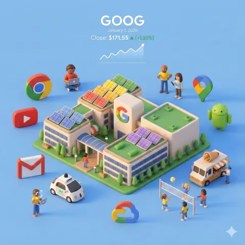
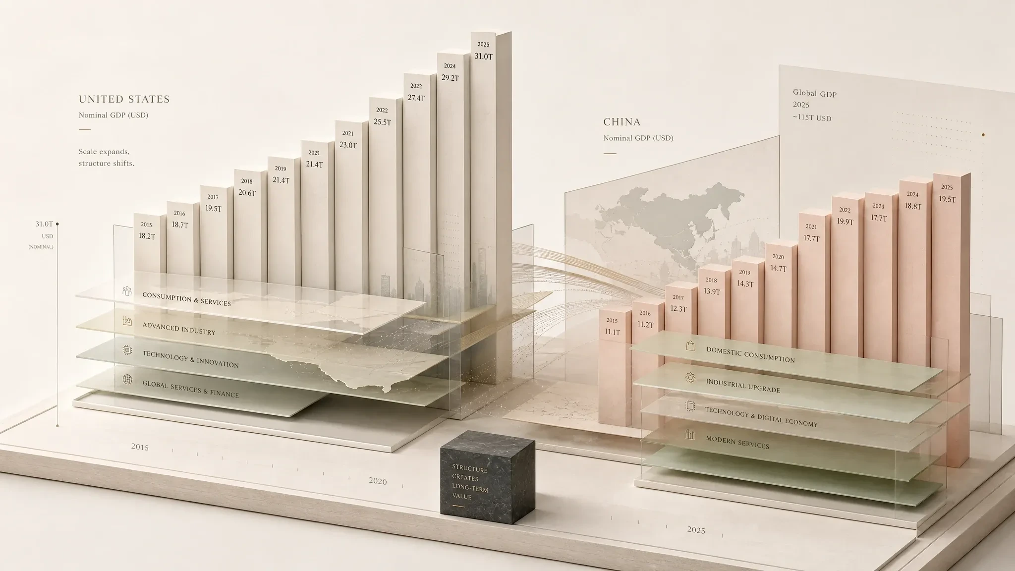
high-end editorial information visual of GDP
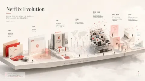
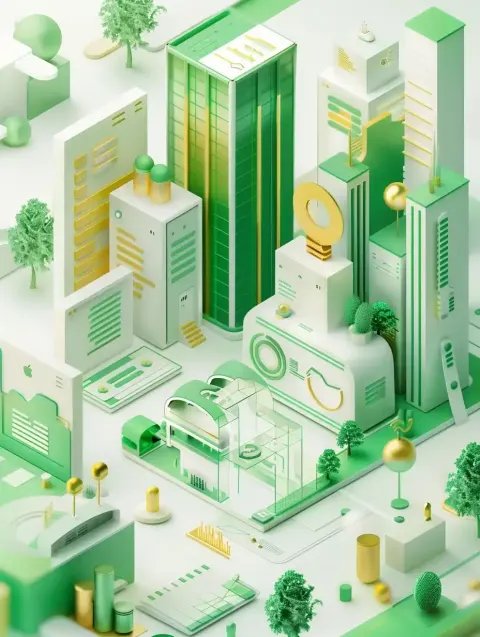
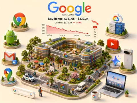
Create a high-end editorial information visual — not a standard infographic, not a template chart, but a quiet, spatial data landscape where information, text, emotion, and structure become a miniature architectural scene.

Before generating the image, evaluate the source of information:
If the user provides tables, screenshots, reports, images, or structured data, prioritize and extract the most meaningful visual hierarchy from them.
If only a topic, industry, year, or concept is provided without data, you must first retrieve and verify relevant information when needed — especially for anything related to current trends, markets, pricing, platforms, policies, rankings, or news. Do not fabricate data. If no reliable information is available, request clarification before generating.

Transform information into geometric spatial objects:
- High-importance data becomes tall, stable vertical pillars
- Medium importance becomes floating blocks or layered planes
- Low or implicit information is placed in edges, shadows, gaps, labels, or thin lines
- Contrasting ideas can move vertically, forming quiet spatial tension

The composition should feel like a carefully constructed micro landscape:
built from cubes, thin columns, flat slabs, curved containers, floating plates, folded surfaces, and minimal symbolic objects.
Avoid any chart-like or dashboard-like appearance.

Use a large amount of negative space as breathing room.
The composition can be centered or slightly off-center, allowing emptiness to become part of the structure.

The visual base should feel light but structured:
a thin platform, translucent boundary, or abstract architectural stage.
A subtle dark anchor element may exist, but only as a small structural grounding — never dominant.

Color system must be unique per topic:
low saturation, soft contrast, warm and airy tones such as cream, sand, soft yellow, muted green, blush tones, light wood, and off-white.
Avoid neon, digital gradients, or tech-style blue/purple schemes.
Shadows are soft and minimal; edges are clean but not harsh.

Typography is part of the structure, not decoration:
- Core statements may float in open space or sit vertically
- Secondary labels attach to edges, surfaces, or geometry
- Numbers behave like subtle measurement marks
- Text must be sparse, precise, and spatially integrated

Occasional small human figures may appear for scale:
standing, observing, walking, or measuring.
They should be minimal, abstract, and non-dominant.

Symbolic objects can be included when relevant (books, screens, maps, plants, documents, light beams), but they must always be simplified into geometric or abstract forms.

Final output should feel suitable for:
editorial cover, keynote slide, report visualization, brand storytelling, or modern knowledge design.

It should feel like a “landscape of information” rather than a description of information.

Now request the user to provide:
- Topic
- Core message
- Existing text or data
- Whether web research is needed
- Reference images (optional)
- Intended usage scenario