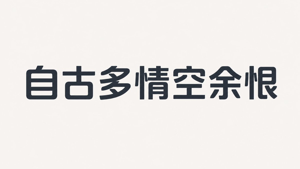
This is a sans-serif font with a wider face, slightly lower center of gravity, and open counters, based on a humanist structure. The overall layout is compact but not crowded. Strokes have low contrast, with horizontals slightly thinner than verticals. Curves are full on the outside and tight on the inside, using small-radius rounded corners and slight diagonal cuts at the ends. Character spacing is tight but internal whitespace is sufficient. Repeating components maintain identical curvature. Core identifying characters include lowercase a, e, the number 2, and uppercase R. Bold versions increase weight by expanding the inner stroke rather than compressing counters.
——
Text: Shanghai tap water comes from the sea
Aspect Ratio: 16:9

 GPT Image
 2
GPT Image
GPT Image 2

 Midjourney
 Nano Banana