GPT Image 2
Dark SaaS Analytics Dashboard
{
 "type": "dark SaaS analytics dashboard UI",
 "product": {
 "brand": "AICode\",
 "theme": "dark navy blue glassmorphism interface with subtle gradients, soft glow, rounded cards, thin borders, modern developer-tool aesthetic"
 },
 "canvas": {
 "aspect_ratio": "16:9",
 "background": "deep midnight blue with faint vignette and soft radial lighting"
 },
 "layout": {
 "structure": "left sidebar plus main content area",
 "sections": [
 {
 "title": "Sidebar",
 "position": "left",
 "count": 8,
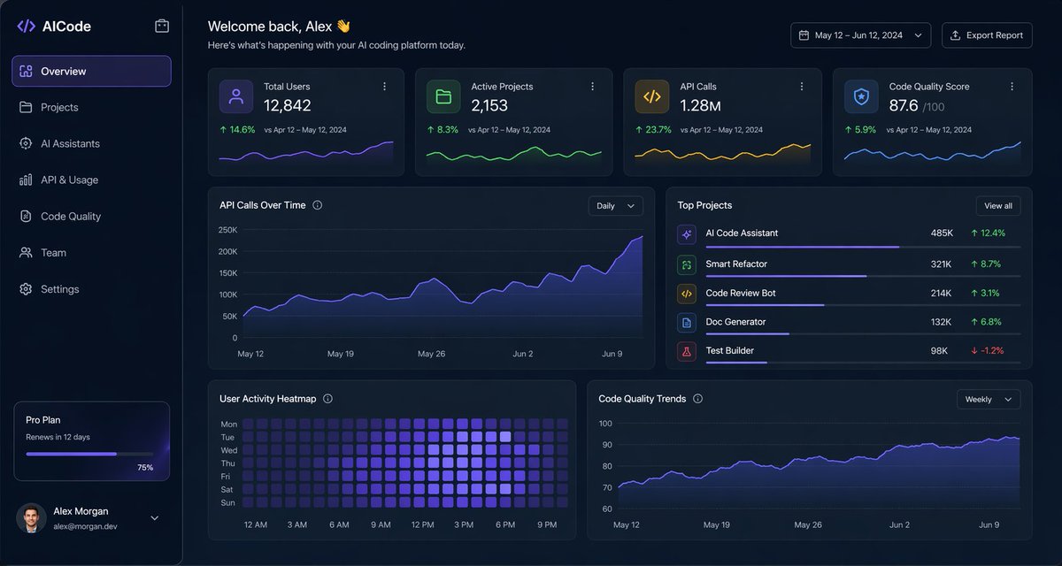
 "labels": ["AICode", "Overview", "Projects", "AI Assistants", "API & Usage", "Code Quality", "Team", "Settings"],
 "details": "logo at top, Overview selected with purple highlight, lower subscription card showing Pro Plan, renews in 12 days, horizontal progress bar at 75%, user profile at bottom with avatar, Alex Morgan\, and email alex@morgan.dev"
 },
 {
 "title": "Header",
 "position": "top main area",
 "count": 4,
 "labels": ["Welcome back, Alex 👋", "Here's what's happening with your AI coding platform today.", "May 12 – Jun 12, 2024", "Export Report"],
 "details": "large greeting on left, date range picker and export button on right"
 },
 {
 "title": "Metric cards",
 "position": "top row under header",
 "count": 4,
 "labels": ["Total Users", "Active Projects", "API Calls", "Code Quality Score"],
 "values": ["12,842", "2,153", "1.28M", "876"],
 "details": "each card has a small colored icon, large main value, comparison text vs Apr 12 – May 12, 2024, positive change percentages 14.6%, 8.3%, 23.7%, 5.9%, and a miniature line chart at the bottom; colors are purple, green, amber, and blue"
 },
 {
 "title": "Main analytics panels",
 "position": "middle and bottom rows",
 "count": 4,
 "labels": ["API Calls Over Time", "Top Projects", "User Activity Heatmap", "Code Quality Trends"],
 "details": "API Calls Over Time is a wide area chart with Daily dropdown and rising purple line ending near 250K; Top Projects is a ranked list of 5 items with progress bars and percentage changes; User Activity Heatmap is a 7-row weekly heatmap with hour labels from 12 AM to 9 PM; Code Quality Trends is a line chart with Weekly dropdown and smooth upward purple trend from about 70 to low 90s"
 },
 {
 "title": "Top Projects list",
 "position": "middle right panel",
 "count": 5,
 "labels": ["AI Code Assistant", "Smart Refactor", "Code Review Bot", "Doc Generator", "Test Builder"],
 "values": ["485K", "321K", "214K", "132K", "98K"],
 "details": "green positive deltas for first four items 12.4%, 8.7%, 3.1%, 6.8%, and red negative delta -1.2% for Test Builder; each row has a colored square icon and thin horizontal progress bar"
 }
 ]
 },
 "style": {
 "visual_language": "premium fintech and AI product design mockup",
 "rendering": "crisp high-fidelity UI mockup, subtle shadows, neon edge lighting, polished charts, clean sans-serif typography",
 "primary_accent": "electric purple\",
 "secondary_accents": ["emerald green", "amber yellow", "cyan blue"],
 "density": "information-rich but spacious, balanced grid, highly legible"
 }
}