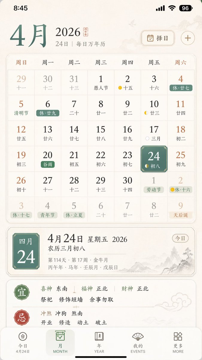
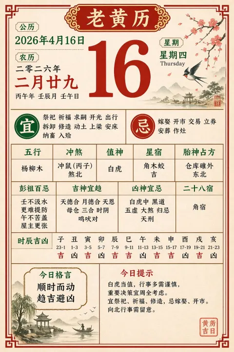
A clean, elegant iPhone app UI mockup for a Chinese perpetual calendar and almanac app, shown as a full-screen mobile screenshot on a soft warm white background with subtle paper-like texture and refined East Asian editorial aesthetics. The interface uses a minimalist serif-and-sans mix, muted brown, gray, black, pale blue, green, and gold accents, with spacious layout and delicate dividers. Show the iOS status bar at the top with the time 8:45, cellular signal, Wi‑Fi icon, and a battery indicator reading 96. Below it, a header for 4 with secondary text “24 | ” and, on the right, a rounded rectangular date-picker button labeled “” with a calendar icon plus a separate plus symbol. The main section is a monthly calendar grid for 2026, with 7 weekday columns labeled Sunday through Saturday in Chinese: , , , , , , . Render a 6-row month view with exactly 42 date cells including adjacent-month dates. The visible dates should be: first row 29, 30, 31, 1, 2, 3, 4; second row 5, 6, 7, 8, 9, 10, 11; third row 12, 13, 14, 15, 16, 17, 18; fourth row 19, 20, 21, 22, 23, 24, 25; fifth row 26, 27, 28, 29, 30, 1, 2; sixth row 3, 4, 5, 6, 7, 8, 9. Each day cell includes a large Gregorian date and a smaller Chinese lunar date or note underneath. Include colored holiday and solar-term tags across specific cells, with exactly 10 highlighted labels visible: “” on the 4th, “” on the 5th, “” on the 6th, “” on the 20th in green, “” on the next-month 1st, “” on the next-month 2nd, “” on the last-row 3rd, “” on the last-row 4th, “” on the last-row 5th, and “” on the last-row 9th in orange. Add small lunar phase markers on a few days, including yellow crescent or dot icons around the 2nd, 10th, 17th, 24th, and next-month 2nd. Make the 24 cell in the Friday column stand out with a rounded blue gradient tile and soft shadow, with smaller text “” inside. Beneath the calendar, show a detailed daily information panel separated by whitespace. The left side features a very large date title “424”; the right side stacks “ 2026” and “”. Below that, include smaller gray metadata lines such as “114 · 17 ” and a traditional sexagenary/date string like “ · ”. At the far right of this metadata area, place a rounded outline pill button labeled “”. Underneath, present a large white rounded card with almanac guidance. The card contains two major sections with exactly 2 headings: a green “” section and a red “” section, separated by fine dotted dividers. In the “” section, include the directional fortune line “ ” and three activity items: “”, “”, “”. In the “” section, include the conflict line “ ”. At the bottom, show a 5-item iOS-style tab bar with labels exactly “”, “MONTH”, “YEAR”, “EVENTS”, “MORE”; the first tab is active and includes the small sublabel “424”. Overall style: premium app design concept, calm scholarly Chinese calendar aesthetic, high-fidelity mobile product shot, realistic yet idealized interface, perfectly aligned typography, subtle shadows, soft contrast, and polished startup-quality UI.

 GPT Image
 2
GPT Image
GPT Image 2

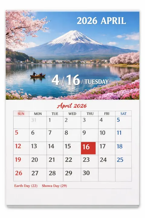
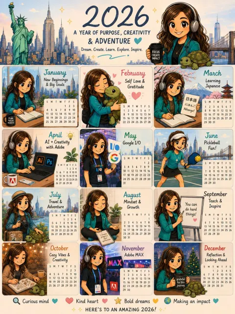


 Nano Banana