GPT Image
Brand Packaging System Display
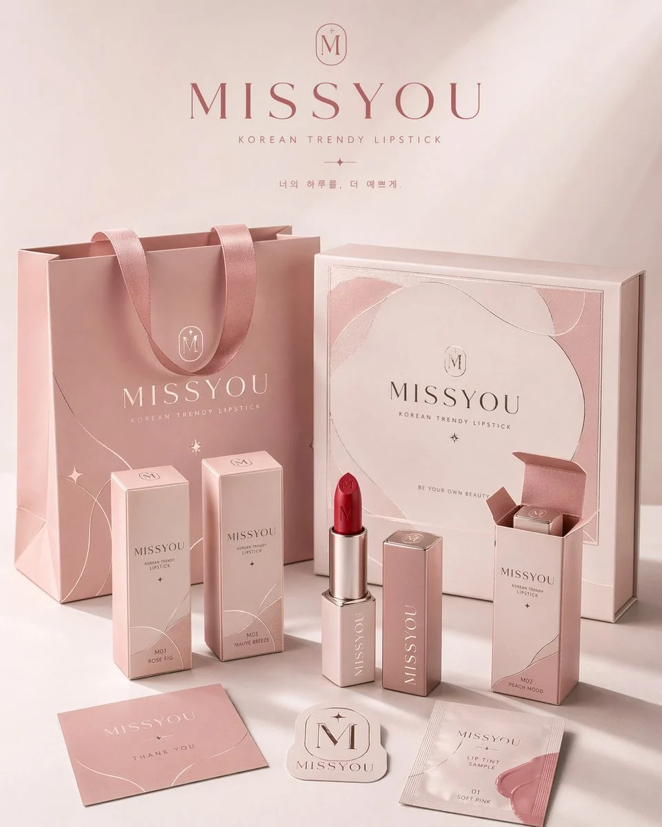
Title: Please create a highly aesthetic and highly complete "Brand Packaging System Display Image" for the brand [Brand Name], category [Brand Category]. This is not an ordinary e-commerce white-background image, also...

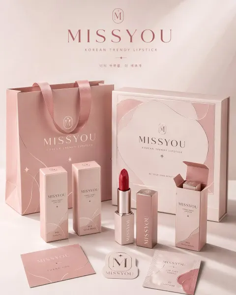
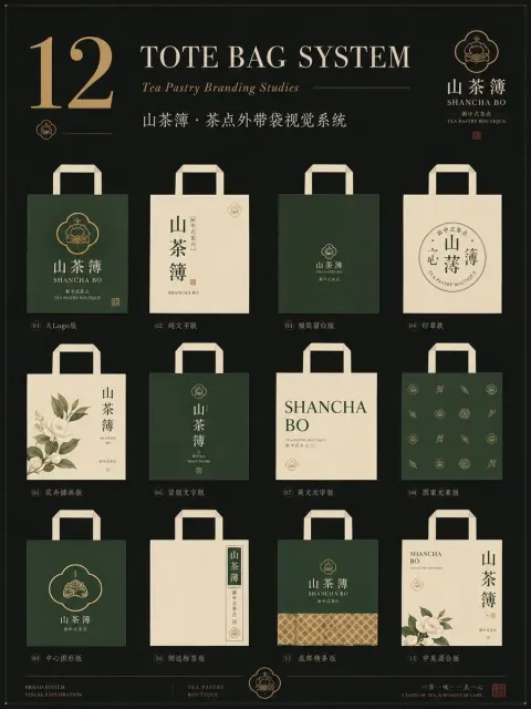
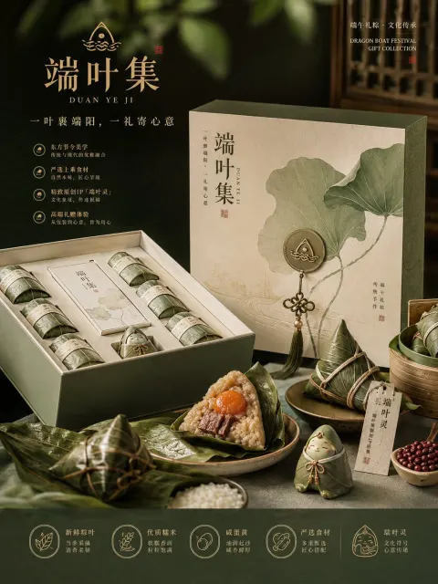
Prompt: Please create a highly aesthetic and highly completed "brand packaging system display image" for the brand [brand name], category [brand category]. This is not an ordinary e-commerce white background image or a single product image, but a packaging family display rendering that embodies brand proposal feel, visual identity system, and commercial photography quality. The image should reflect "the unified implementation of the same brand across multiple packaging carriers," presenting a complete packaging system of a mature consumer brand.

[Size Requirements] The overall composition must be a fixed 4:5 vertical poster, with a clear vertical orientation. Horizontal compositions, wide desktop displays, or overly scattered horizontal displays are prohibited. The overall composition must follow the poster reading logic: the top should retain a sense of breathability, the center be the main visual focal point of the brand's packaging system, and the lower should arrange auxiliary packaging, labels, and the product itself. The overall focus should be concentrated, making it suitable for direct brand display posters.

[Core Requirements] Automatically match the most reasonable and natural packaging combinations and product forms according to the [category], and establish a unified brand visual system around the [brand name]. Select a small but representative packaging form in the image, forming a complete and refined brand packaging system, not focusing on piling up quantities but emphasizing primary-secondary hierarchy, brand unity, and display aesthetics. Depending on the category, select some of the following packaging types: tote bags / shopping bags, paper boxes / gift boxes / outer packaging boxes, strip boxes / single item boxes / set boxes, packaging bags / envelopes / sample bags / soft bags, cups / bottles / jars / tubular containers / spray bottles / pump bottles, labels / stickers / seals / hang tags / small cards, as well as the actual product body corresponding to the category.

[Category Adaptation Logic] Packaging form and product form need to be automatically matched according to the [category], but not limited to a single direction. You can refer to the following adaptation logic for free interpretation: If the category is food/bakery/snack/beverage, focus on paper bags, cartons, packaging bags, cups, food containers, stickers, seals, and the actual product itself; If the category is tea beverages / coffee / beverages, focus on cups, bottles, canned packaging, tote bags, cup sleeves, sealing stickers, gift boxes, etc.; If the category is beauty / skincare / makeup / perfumes, focus on bottles, cans, tubes, boxes, gift boxes, tote bags, sample packaging, etc.; If category is fragrance / home / lifestyle, focus on aromatherapy bottles, candle cups, packaging boxes, gift boxes, tote bags, hang tags, label cards, etc.; If the category is apparel/accessories/trendy toys/cultural and creative, the main products are packaging boxes, drawer boxes, dust bags, tote bags, stickers, hang tags, and accessory packaging; If the category is digital accessories/tools/small consumer goods, the main products are hard boxes, outer packaging boxes, storage bags, instruction cards, stickers, envelopes, labels, etc. The overall focus must be on the effect of "reasonable categories, unified branding, and systematic packaging."

[Quantity and Density Control] Control the number of items on the screen, avoid excessive piling, and do not display all possible packaging forms. Overall, the brand packaging system should present the effect of "few but refined, complete but not crowded." It is recommended to choose the most representative packaging carriers for display: large packaging 1~2 pieces, medium packaging 2~3 pieces, small packaging or auxiliary items 2~4 pieces, real product body 1~3 pieces, and the total visible elements should be controlled between 6~10. Packaging types should reflect layering and a sense of system, but avoid repeating too many similar items. The image should have enough blank space and a sense of breathability, ensuring each package is clearly visible, prioritized, and arranged smoothly. Better to be few but refined than to overfill for "completeness."

[Brand Visual System Requirements] All packaging must belong to the same brand system, uniformly using [Brand Name] as the core brand identity element. The overall design should have consistent logo/logo presentation, font style, graphic language, illustration language or pattern system, layout logic, color scheme, materials, and print texture. Brand tone, color direction, pattern elements, auxiliary graphics, and visual atmosphere should be automatically matched and reasonably spread according to the [category], not limited to any fixed style. The overall style should be unified, harmonious, and brand recognizable. It can be minimalist and sophisticated, natural organic, fashionable and modern, light luxury and refined, youthful and fresh, artistic, trendy or elegant, but must meet the characteristics of the [category] and present a mature brand design completeness.

[Color Matching Mechanism Requirements] The overall color scheme should not be fixed to a single fixed combination, nor should highly similar main color systems appear multiple times in succession. Each generation should actively form different main color schemes and color relationships based on the [category] and brand temperament, using a "controlled divergence" approach for color interpretation. Colors can be low-saturation natural colors, modern neutrals, light vintage colors, bright and fresh colors, light luxury dark tones, or artistic mixed color schemes, but must maintain a high-end, unified, restrained, and brand-like feel. Different visual temperaments are allowed each generation, such as cream white with caramel brown, misty gray with warm white, olive green with flax rice, wine red with cream white, cocoa brown with ivory white, charcoal gray with wheat straw gold, misty pink gray with off-white, navy blue with warm gray, etc., serving only as reference directions rather than fixed templates. Do not use fluorescent colors, avoid cheap high-saturation colors, and avoid chaotic and uncontrolled multicolor collage.

[Image Composition and Display Requirements] The image adopts the brand's packaging family display logic rather than cluttered stacking. The overall setup is a commercial studio setting, using a 3/4 low view angle or a slightly transparent front display angle to create a layered, orderly, and primary, hierarchical packaging display image. Composition follows the logic reference: In the background, place 1~2 larger packages as visual support, such as tote bags, large gift boxes, or large outer boxes; In the middle frame, arrange the brand's core packaging or main product packaging as the main visual focal point; Place smaller packaging, auxiliary packaging, labels, stickers, and the actual product itself in the foreground; At least one real product naturally interacts with the packaging, such as partially exposed, placed in front of the packaging, or displayed in combination with the packaging; Overall form a balanced and design-oriented triangular or staggered composition. The visuals are clean, with blank spaces, not crowded, rich but restrained, and a limited yet precise combination of packaging reflects a complete brand packaging ecosystem.

[Visual Style Requirements] Overall, present a high-end commercial photography texture and brand proposal feel. The background should be a clean studio environment, which can be white, warm white, light gray, or a minimalist background automatically matched according to the brand's tone. The image should emphasize authentic packaging material performance, clear paper creases, box structure, bottle and can contours, label details, print texture, material details such as embossed/hot stamping/matte/cotton paper textures/kraft paper textures, as well as unified and sophisticated color combinations, a refined modern and clean brand visual language, and a strong sense of "this is a complete brand packaging system."

[Light and Shadow Requirements] Use real commercial photography-grade lighting, suitable for soft studio lighting or with slightly directional natural side lighting. Clear but restrained shadows are needed to enhance three-dimensionality, spatial sense, and high-end feel. Overall lighting should be transparent, bright, and clean; avoid darkness, cheapness, or cluttered backgrounds.

[Final Effect Requirements] The final image should resemble a mature brand's packaging system display poster, family proposal art, or brand visual implementation rendering, rather than a scattered product puzzle. Key highlights: fixed 4:5 vertical poster feel, brand unity, packaging family integrity, commercial photography feel, design proposal sense, category fit, as well as high-end aesthetics and visual completeness.