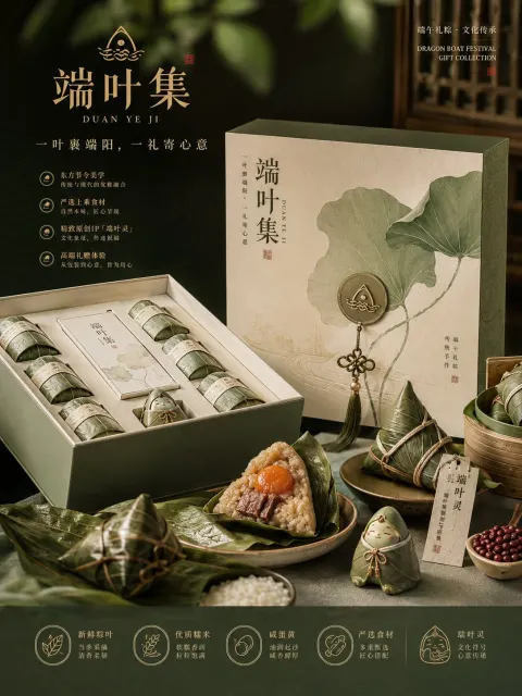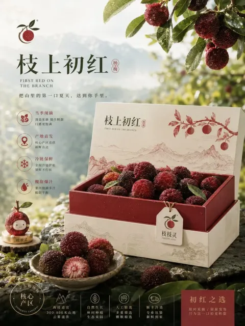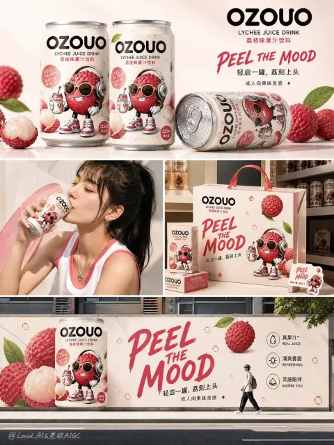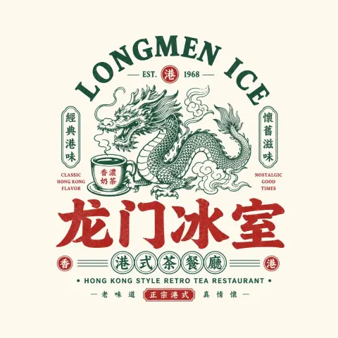
GPT Image
Brand Visual Proposal Generator
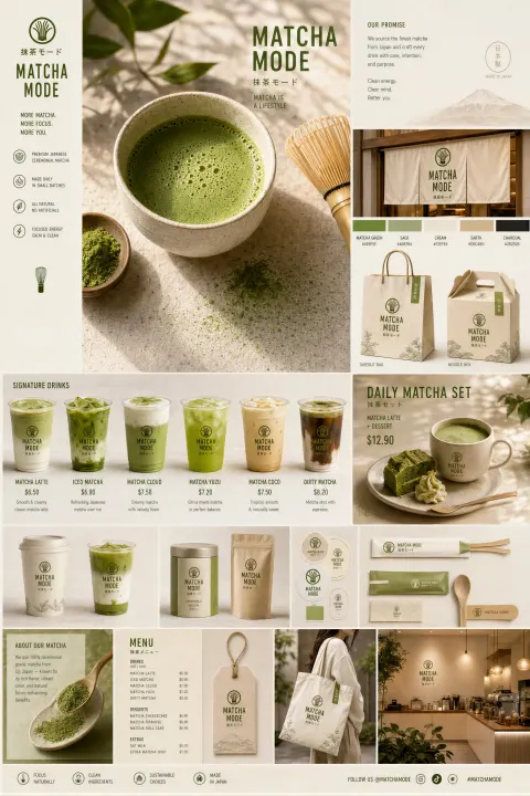
Title: Based on the brand information entered by users, create a highly completed set of "4-Board Brand Visual Proposals / 4-Board Brand ...

Prompt: Based on the brand information entered by the user, create a highly completed "4-Board Brand Visual Proposal" with a unified visual system.

Note: This is not a four-grid puzzle, nor is it a total image combining four pieces of content into one frame, but rather a set of four independent images that need to be "generated sequentially." You need to continuously generate these four images within the same brand visual system. The four images must clearly belong to the same brand, but each card has a different role—it can't just be four repetitive variants.

[User Input]
Brand Name: [Brand Name]
Brand Type / Industry: [Brand Type / Industry]
One-sentence brand positioning: [One-sentence brand positioning]
Core Keywords (3–6): [Core Keywords]
Target Audience: [Target Audience]
Overall Style Direction: [Overall Style Direction]
Slogan:【Slogan】
Featured Products / Core Services: [Featured Products / Core Services]
Brand Story / Regional Features: [Brand Story / Regional Features]
Main Color Tone: [Main Color Tone]
Auxiliary Color Preferences: [Auxiliary Color Preferences]
Need IP Characters: [IP Characters: Yes / No]
IP Character Direction: [IP Character Direction]
Preferred application directions: [Packaging / Stores / Posters / Social Media / Official Website / APP / Peripherals / Others]
Styles to avoid: [Styles to avoid]
Aspect ratio: [Aspect ratio]
Other Supplementary Notes: [Other Supplementary Notes]

[Main Quest]
First, based on the above information, internally refine and unify the brand's visual DNA, then generate four separate images based on the same brand DNA.

Before officially generating the four images, please unify the following content and always maintain consistency in the subsequent four images:
1. Core brand temperament
2. Brand visual keywords
3. Main color / secondary color / accent color
4. Font Preferences and Character Style
5. Graphic Language / Auxiliary Graphic Language
6. The visual presentation of products or services
7. Whether to use IP characters and the direction of character settings
8. Suitable application materials and communication scenarios for the brand
9. Overall visual style: brand sense, proposal feel, commercial feel, display feel, series feel
10. Make the four images look uniform in style, but clearly divide the information; don't make them a variant with repeated content

[Overall Unified Requirements]
1. All four images must clearly belong to the same brand system: brand name, color system, font style, graphic language, brand symbols, IP characters (if any), and product logic must be consistent.
2. The four images are not four duplicate posters, but four brand visual proposals representing different responsibilities.
3. All four images must be highly complete, with a sense of brand proposal, commercial appeal, presentation, and portfolio quality.
4. Layouts can vary, but the overall aesthetic, design language, and visual system must be highly unified.
5. Automatically matches the most suitable visual application content based on different brand types:
 - Food & beverages: packaging, cups, paper bags, bottles, labels, stores, advertising posters, etc
 - Beauty / FMCG: bottles, boxed packaging, gift boxes, series packaging, displays, advertising KVs, etc
 - Technology / Digital Brand: Official homepage, app interface, brand cards, digital scenes, UI displays, etc
 - Cultural & Creative / IP / Retail: merchandise, stickers, badges, gift boxes, tote bags, posters, stores, etc
6. If text appears on the screen, ensure the brand name, title, and module name are concise and clear, with a strong brand feel, and avoid excessive lengthy copywriting.
7. Each image should be suitable for independent display, and when four images are placed together, it should clearly show that they form a complete set of proposals.
8. Do not combine four images into one picture, do not use a four-grid grid, and do not create a one-page overview collage.
9. Please generate in order: Sheet 1 → Sheet 2 → Sheet 3 → Sheet 4.
10. Only the current independent image is generated each time, and the previously established brand system is automatically continued until all four images are completed.

[Fixed Structure and Responsibilities of the Four Diagrams]

Image 1: Brand Hero Board
This image sets the tone, serving as the cover image and the first visual focal point for the entire proposal.
Key highlights to highlight:
- Brand name
- Slogan (if any)
- Core brand temperament
- Visual translation of brand keywords
- Core main visual elements
- Main color system
- Represents the brand's core symbols: products, materials, graphics, characters, visual installations, atmospheric elements, etc
Requirements:
- More like a cover image / Hero Image than a manual
- The visuals have visual impact and a sense of sophistication
- Strong brand awareness
- Don't overload the information; highlight the "first impression point"
- If the brand fits the IP role, it can appear, but it should serve the overall brand visual system
Objectives:
It makes it easy to tell who the brand is, what its temperament is, and what the first impression is.

Image 2: Brand Identity System Diagram / Identity System Board
This diagram explains how the brand's "visual system is structured."
Key highlights to highlight:
- Brand name / logos and logos are presented
- Main color, secondary color, accent color
- Font temperament and glyph style
- Auxiliary graphics / patterns / icon / sticker / label languages
- Packaging pattern logic or brand identity elements
- If appropriate, systematic display of IP characters can also be added, such as expressions, actions, and extension methods
Requirements:
- More structured and proposal-oriented than the first album
- More like a brand system proposal board, but not as rigid as a traditional VI manual
- Clear modules and well-defined logic
- Maintain a sophisticated aesthetic and avoid piling up information
Objectives:
It clearly shows how the brand's visual identity language is built.

Map 3: Product & Packaging Board
This chart is designed to show how the brand truly embodies the "product/packaging/service carrier," reflecting its commercial implementation capability.
The most suitable application format needs to be automatically matched according to brand type, for example:
- Food & beverages: cups, bottles, cup sleeves, paper bags, straw sleeves, packaging boxes, takeout bags, stickers, labels, etc
- Beauty / FMCG: bottles, cans, boxes, gift boxes, series packaging, shelf display, etc
- Technology / Digital Brand: Official homepage, app interface, brand cards, digital product interfaces, service displays, etc
- Cultural & Creative / IP / Retail: merchandise, badges, stickers, stationery, gift boxes, labels, packaging extensions, etc
Requirements:
- Emphasizes "productization / packaging / sellable / usable / implementable"
- There must be at least one main application carrier, and several extended applications may also exist, but there must be primary and secondary applications
- The images should have the feel of authentic commercial photography, product display, or proposal board display
- Don't just display a bunch of things; make sure a unified brand system is already in place
Objectives:
This shows that this brand not only has a concept but can truly become a product system that can be sold, used, and executed.

Map 4: Communication and Scenario Application Diagram / Campaign & Space Board
This image is used to showcase the visual effects of the brand when it enters real communication scenarios, reflecting brand recognition, communication power, and scenario extension capabilities.
The most suitable scenario needs to be automatically matched according to brand type, for example:
- Store facade / signage / Counter / Wayfinding system
- Poster KV / Social media ads / Standee / Lightbox / Outdoor advertising
- Pop-up stores / booths / brand event spaces / display spaces
- Official homepage / social media feed / digital communication interface
Requirements:
- The sense of scene should be stronger than in the third photo, reflecting the brand's communication effect after entering the real world
- You can lean towards a sense of advertising, space, or display, but still retain the style of the proposal
- Do not duplicate the third image as a simple packaging display
- The brand system still needs to be consistent: brand name, color, font, graphics, IP characters (if any), and tone should all be consistent
Objectives:
This shows that this brand has distinct recognition and strong brand expression in real-world communication and application scenarios.

[Implementation Method]
Please strictly follow the following procedures:
1. First, internally understand and unify the brand's visual DNA.
2. Then start generating the first image: the main brand visual cover image.
3. While maintaining the same brand system, continue to generate the second image: the brand identity system diagram.
4. While maintaining the same brand system, continue to generate the third image: Product and Packaging Application Image.
5. While maintaining the same brand system, continue to generate the fourth image: Communication and Scenario Application Image.
6. During the entire process, do not merge 4 images into one, do not turn them into a 4-grid grid, and do not let the content of 4 images repeat.
7. Always remember: these are four consecutive brand visual proposal images for the same brand, not four different projects.

[Ultimate Goal]
Output a set of four independent yet highly unified brand visual proposal images:
- The first sheet sets the tone
- The second is responsible for explaining the system
- Page 3 is responsible for product implementation
- Chapter 4 is responsible for communication and scene implementation

The complete set of results should have:
A unified brand visual DNA, clear page division of labor, highly refined aesthetics, a sense of business proposal, presentation, portfolio quality, and effects that can be directly used for brand concept presentation.