GPT Image
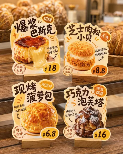
Commercial Promo Signage Design
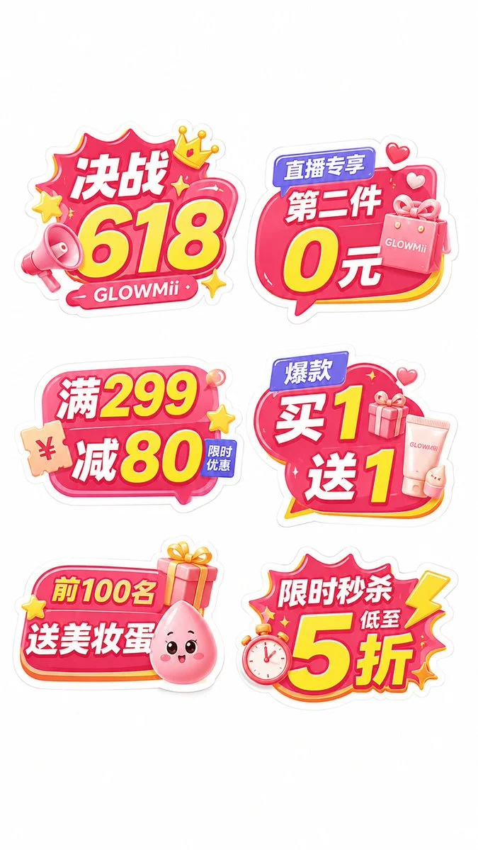
Title: The entire image shows 6 independent hand-held cards, each fully visible, separated from each other, not overlapping, not merging into one large card, using a clear 2-column ×3...

Prompt: The entire image shows 6 independent holding cards, each fully visible, separated without overlapping or merging into one large card. Use a clear 2-column ×3-row layout, with a comfortable blank space and a clean white background, highlighting each holding card itself. Each case is a separate image; do not merge multiple cases together.

Overall style requirements: Refer to the style of high-quality commercial promotional signage materials. The image should have a mature commercial feel, originality, and strong detail. It should not be crude, too flat, or like kindergarten stickers. Each signboard must have a distinct multi-layer structure: thick white outer outlines, colored irregular main base plate, inner layer highlighter strokes, slight three-dimensional effect, moderate projection, partial gradients, rich but not cluttered 3D small icons, large main information, and auxiliary small tags. The overall look should resemble real KT board/PVC shaped handheld signs, with complete edges and a stable structure, suitable for cutting with molds and for handheld photos.

The entire color scheme revolves around the [main tone], paired with [auxiliary colors] and [accent colors]. The overall look should be eye-catching, unified, and has an active atmosphere. Don't stick to a single color, nor be too plain. Icon elements should be centered around [industry scene keywords]. You can add [Icon Element 1], [Icon Element 2], [Icon Element 3], [Icon Element 4], [Icon Element 5], etc., to enhance the sense of activity and finished product.

Please generate the following 6 independent hand-holding sign copy, and ensure each copy has a more suitable irregular outline and icon configuration:
1. [Synopsis 1]
2. [Synopsis 2]
3. [Synopsis 3]
4. [Synopsis 4]
5. [Synopsis 5]
6. [Synopsis 6]

Require the six holding signs to have varied shapes; don't all six look the same. Use flexibly: bubble frames, dialogue boxes, explosion boxes, arrow boxes, rounded label frames, coupon frames, product design frames, lightning frames, and other irregular outlines, but the whole set should maintain a unified series feel. The font must be in bold Chinese promotional font style, with clear and prominent main message, suitable for long-distance recognition; If the copy includes numbers, discounts, prices, number of items, gifts, or other benefit points, these numbers and keywords must be clearly amplified to serve as the visual centerpiece.

Key point: The entire set of images should resemble a set of handheld sign material schemes that will actually be used in [applicable scenarios], providing both a photo and check-in feel, a promotional spread, and a sense of commercial implementation. Avoid: Too flat, too crude, child-centered sticker look, all six are the same type of cloud frame, too few icons, lack of layering, lack of commercial activity, weak text, resemble ordinary electronic stickers rather than physical handheld signs.

Final output requirements: high definition, white background, vertical 9:16, 6 independent handheld signs displayed within a single image, rich details, strong originality, attractive appearance, and suitable for future reference and production.