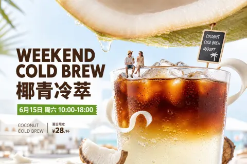
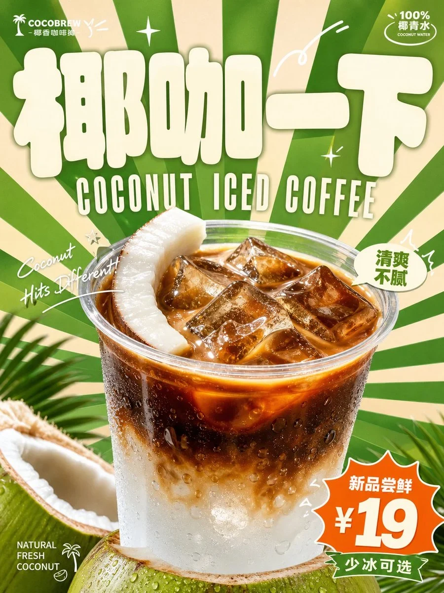
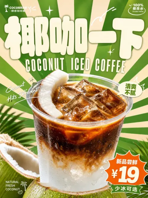
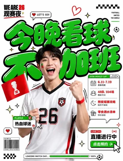
A bright, light and fast retrospect commercial visualization is generated around the specific beverage theme: the first shot of the image is the creation of memory points by a very large, thick, rounded theme label, the font is like a soft, plentiful face, the light colour fills, the edges are clean, and the upper visual focus is pressed; the main beverage body is present in the centre of the lower centre with a real commodity phototic sense, at a close range, with clear light, condensed water or liquid light, natural shadows, covering the background and parts of the text forward, so that the flat graphics and real products form a strong backward and forward layer. The background uses radioactive surfaces that spread outward from the vicinity of the main subject, with sharp and dense borders, resulting in a sense of speed and joy. The text system is composed of three layers: the largest primary font, the subheadings are attached to it with a narrow, high-high, retrostate uppercase font, the small font information is scattered around the corner, the handwritten italic shorts pass around the body by an arc or anore, and the rhythm is enhanced by a small number of white lines. Colours are extracted from the taste, material, brand emotions of beverages, keeping large areas of bright structure, small contrasts of colour, light message text and warm body colours; overall high-resolution, high-saturated but clean ventilation, clear-coloured, fresh emotions, skins, energy-filled particles, and avoiding dark, dark, obscurous layers and low-dynamic retrograde particles. –- Presentation ratio: vertical: 3:4, suitable for shopping malls fast-shuffled; main object: [photo Subject] Live text: Main word "[main title]", subtitle "[subtitle]" and side corner small words "[minor corner word]" to the roadman's sense: [photo atmosphere description]

 GPT Image
 Midjourney