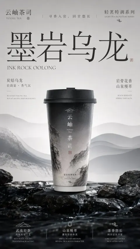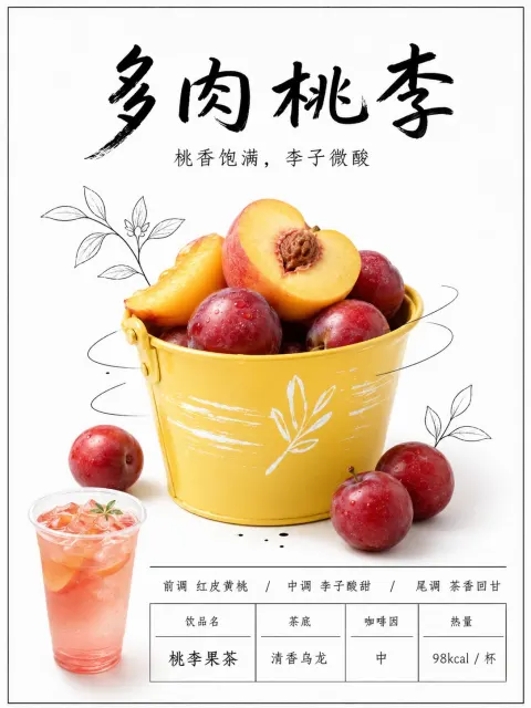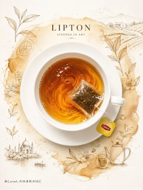
GPT Image
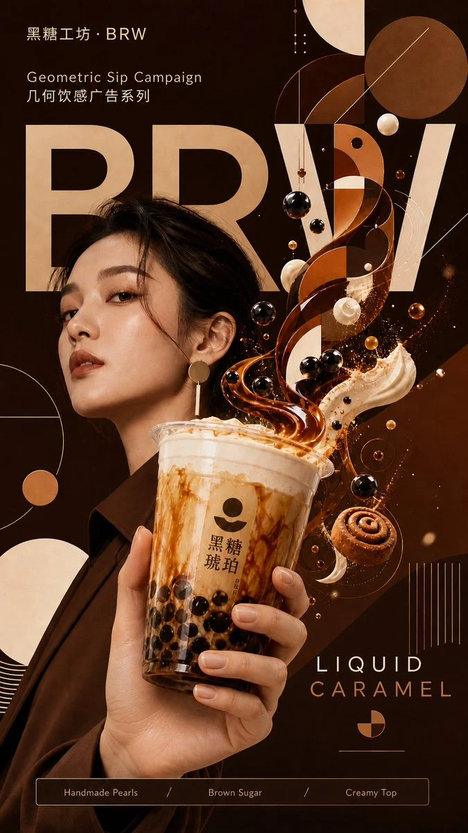
Geometric Beverage Brand Visual
Title: [User Input]

Prompt: [User input]
Brand name: [Fill in the brand name, can be a real or fictional brand]
Brand abbreviation / main visual large font: [fill in 1-6 letters or Chinese characters, e.g., STAR / COSTA / HEYTEA / Yedian]
Product name: [Enter the specific drink name, e.g., Forest Cold Brew Coffee / Tropical Mango Fruit Tea / Brown Sugar Bubble Tea]
Product types: [Coffee / Milk tea / Fruit tea / Sparkling drinks / Energy drinks / Others]
Main color tone: [Enter the brand's main color, e.g., Deep Forest Green / Warm Orange Pink / Electric Blue / Creamy Off-White / Deep Red-Brown]
Auxiliary Colors: [Enter auxiliary colors, e.g., Golden Thin Line / Cream White / Ice Blue / Caramel Brown]
Ingredient Elements: [Fill in 3-6 core ingredients, such as coffee beans, cinnamon, orange peel, milk foam, ice cubes]
Geometric style: [Minimalist geometry / Bauhaus geometry / Futuristic geometry / Oriental blank geometry / Dynamic radiating geometry]
Model settings: [Young men / Young women / Urban white-collar workers / Athletic youth / Fashionable girls / Other specific groups]
Core slogan: [Fill in a short slogan, e.g., TASTE IN MOTION / FLAVOR IS IN MOTION]
Bottom labels: [Fill in 3-4 short labels, such as Fresh Brewed / Rich Aroma / Crafted Daily / Real Ingredients]
Aspect ratio: [Default is 4:5 portrait; if needed, you can fill in 3:4, 2:3, 1:1]

[Important default rules]
By default, a model must appear that matches the brand's product tone.
Unless the user explicitly states "no models appear" or "only products," the screen must include models interacting with drinks.
Models are not background decorations but part of the brand's tone, requiring automatic matching of product types, brand colors, beverage temperament, and advertising styles.

If the user does not fill in the model settings, the model will automatically generate a suitable model based on the product type:
- Coffee: Urban white-collar workers, creative workers, calm and professional temperament
- Milk tea: Fashionable youth, refined and trendy temperament
- Fruit tea: sporty youth, sunny and energetic temperament
- Sparkling drinks: young trendsetters, light street vibe
- Energy drinks: sporty or futuristic youth, with a sense of strength and speed
- Pure Tea / Tea Drink: Cool, restrained, and with an oriental sense of sophistication
- Plant-based drinks / health drinks: natural, refreshing, and a self-disciplined lifestyle and temperament

[Creative Objectives]
This is not an ordinary beverage poster, nor is it simply a product photography, but a brand visual poster that combines "high-end commercial advertising + flat geometric design + hyper-realistic 3D beverage presentation + ingredient flavor visualization + brand tone model."

The core visual concept is:
Translating the flavor, aroma, mouthfeel, energy, and character of a drink into an orderly geometric motion system.
Geometric shapes are not ordinary background decorations, but visual languages that naturally grow from beverage liquids, steam, ingredients, human movements, and light and shadow.

[Overall Style]
The images should present the texture of premium, modern, bold, clean, commercial, high-end advertising, magazine campaigns, and cinematic product photography.
The overall visual should be high-end, impactful, and brand strong, suitable for social media communication, brand advertising, product promotion, and visual case presentations.
The style should be: flat geometric design fused with hyper-realistic 3D beverage, organic ingredients, and premium lifestyle model photography.

[Image Structure]
Use [aspect ratio] vertical commercial ad composition.

The background uses a large area of [main tone] as the brand's color block, which can include rounded rectangles, geometric grids, fine lines, circles, triangles, hexagons, diagonal color blocks, or abstract flat structures.
The background should be clean, orderly, and modern, without clutter.

The main visual is in the center or lower middle of the image:
A [model setting] holds a [product name] cup, positioned at the foreground visual center, creating a slightly wide-angle, close-up advertising shot.
The model should have a clear interactive relationship with the cup: hands genuinely gripping the cup body or lid, arms naturally extending from the person's body, and shoulders, elbows, wrists, and fingers in the direction of the real human body.
Subjects can be facing forward, slightly to the side, but the body orientation, head orientation, gaze direction, arm direction, and cup position must be consistent to create a believable commercial photography moment.

If users clearly choose "no model" or "only product," the product cup is instead suspended alone or placed in the center, presenting a stronger product ad composition.

The cup must have a genuine commercial photography texture:
Clear cup body, authentic materials, natural highlights, delicate shadows, and a three-dimensional sense of volume, making the product highly recognizable.
The cup must not be deformed; the rim, body, and bottom must have proper perspective.

[Consistency Requirements for Figures and Hands]
This is the key quality requirement for this poster.
The model must be a complete, believable figure that matches physical reality, not just a single isolated hand.
The hand, wrist, arm, shoulder, and body must belong to the same person and naturally connect in space.
The action of holding the cup must follow the logic of real photography: fingers naturally circling the cup, thumb position reasonably, wrist angle comfortable, and cup center of gravity stable.
Postures should not be excessively twisted, with reversed arms, misaligned shoulders, broken wrists, extra fingers, fused fingers, deformed palms, floating hands, or hands that do not align with body orientation.
The characters' gaze, head, torso, and cup-holding movements should be coordinated, like a moment shot from a real commercial commercial.
If the composition is close-up, you can crop the subject's body, but you must retain enough connections between the shoulders, arms, and hands, so the audience clearly knows which hand belongs to the model.

[Core Visual Effect: Beverage Transformation into Geometry]
Drinks naturally overflow, rise, or burst from the rim, but not chaotic splashes.
Liquids, steam, ice cubes, milk foam, tea soup, coffee, juice, or bubbles must be designed as controlled geometric moving structures.

The beverage is not simply splashing; it visually transforms into a controlled geometric system.
Liquid streams, steam, ingredients, and flat vector shapes are choreographed as one unified motion structure,
creating the feeling that the product flavor is being translated into geometry.

Specifically, it is reflected in:
1. The beverage liquid has a genuine luster, refraction, viscosity, and flow.
2. Liquid gradually transforms into clean geometric planes in the air, such as circles, triangles, hexagons, arcs, color blocks, and transparent layers.
3. [Ingredient Elements] Suspended around the cup with real 3D material, naturally blending with geometric structures.
4. Steam and aroma or bubbles transform into soft geometric mist layers, fine line trails, and faint glow particles.
5. All elements form a clear visual vortex or radiating structure around the cup, giving the image movement while maintaining sophisticated restraint.
6. The direction of geometric movement should match the character's actions and the direction of the cup, avoiding physical conflicts with the person's cup holding posture.

[Brand Text System]
Giant brand abbreviation / main visual large text added at the back of the screen: [Brand abbreviation / Main visual large text]
The font uses Bold Modern Sans-Serif Typography, partially obscured by figures, cups, or geometric elements, creating a sophisticated advertising layer.
Text should resemble the visual structure in brand advertising, not just regular title stickers.

Small brand name can be placed on top: [Brand Name]
Minimalist label bar at the bottom: [Bottom Tag]
Core Slogan [Core Slogan] can be placed at the upper or lower middle as an advertising statement.

Text layout requirements:
Simple, restrained, clear, and brand-like.
Don't add too much small text.
Don't let words overshadow the main topic.
Overall, it resembles a high-end beverage advertising campaign, not a regular promotional poster.
If the model struggles to accurately generate small text, prioritize ensuring the main visual large print, brand atmosphere, and overall layout, and avoid generating large amounts of incorrect small print or garbled text.

[Light and Material]
Use cinematic commercial lighting, soft volumetric lighting, studio product photography, sharp highlights, and realistic shadows.
Liquids, cups, ingredients, and skin or clothing must be authentic and delicate; Geometric parts should be kept flat, clean, and vectorized.
This creates a strong contrast between "real 3D products and people" and "flat geometric systems."
Figures, cups, ingredients, and geometric elements should share a unified light source, with consistent shadow directions to avoid collage.

[Visual Temperament]
The whole should have a strong sense of advertising blockbuster, design, and a sense of series unity.
The visual focus is clear: first see the geometric explosion of cups and drinks, then the model's temperament, then the geometric system, brand lettering, and bottom labels.
The visuals should be high-end, modern, clean, and dynamic—no cheap AI feel.

[Problem Avoidance]
Don't assume there are no models.
Don't create isolated hands.
Don't let the figure and hand belong to the same body.
Don't let the directions of your hands, wrists, arms, and shoulders conflict with each other.
Do not have extra fingers, deformed fingers, broken wrists, fused fingers, or reverse arms.
Don't let the person's gaze, body orientation, or cup holding direction clash.
Don't stack elements in a messy way.
Don't let geometric backgrounds overshadow the main body of the product.
Don't let the cup deform.
Don't let the cup float out of hand or not actually hold it.
Don't let too many ingredients make the look cheap.
Do not generate errors, garbled text, or excessive text.
Avoid plastic, sticker-like, or collage looks.
Don't try to get the usual milk tea shop promotions.
Don't let low-end e-commerce posters look like they're selling in a poster.
Don't overdo it.
Do not let the liquid look like dirty water or an explosion accident.
Don't let models look like cheap influencer ads.
Don't force characters and products onto them in post-production.

[Final Effect]
A highly polished, sophisticated, modern, and highly commercial-sounding beverage brand poster.
It should look like the main visual of a real brand campaign, while also featuring AI-generated surreal visual memory points.
The default presentation is: brand tone model + real commercial beverage product + ingredient flavor visualization + orderly geometric motion system.