GPT Image
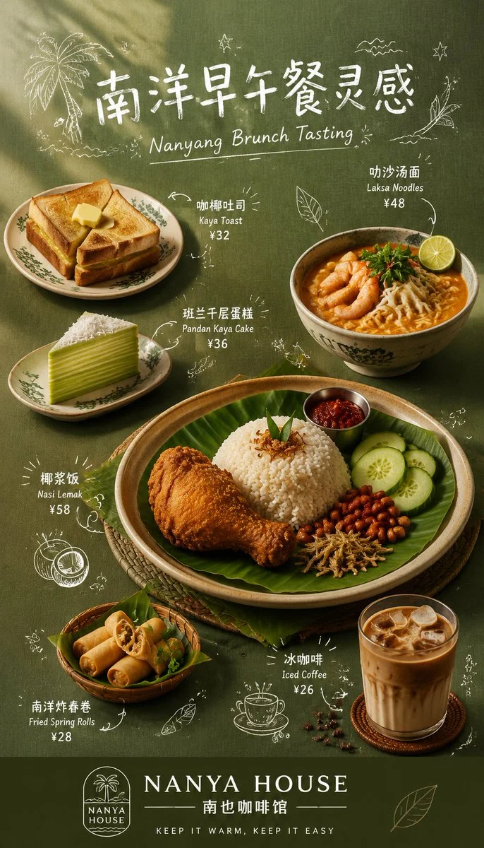
Hand-Drawn Menu Poster Design
Title: 【[Subject Name]】:

Prompt: 【[Subject Name]】:
[[Brand Name]]:
[[Main Title]]:
[[English Subtitle]]:
[[Main Color Tone]]:
[[Background Material]]:
[Main Course]]:
[[Auxiliary Dishes]]:
[[Brand Slogan]]:
[Aspect ratio]: 9:16

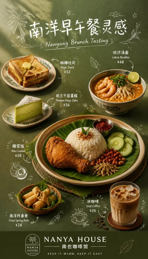
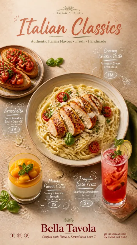
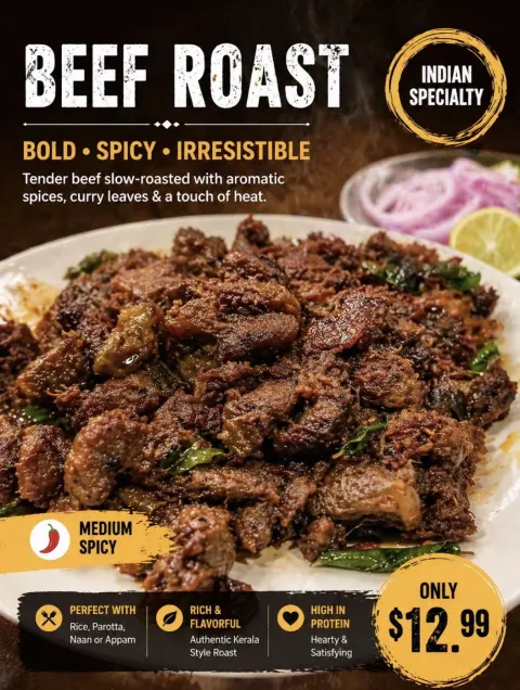
Generate a refined 9:16 vertical hand-drawn menu poster for the restaurant, with the theme [[Theme Name]] and the brand name [[Brand Name]].

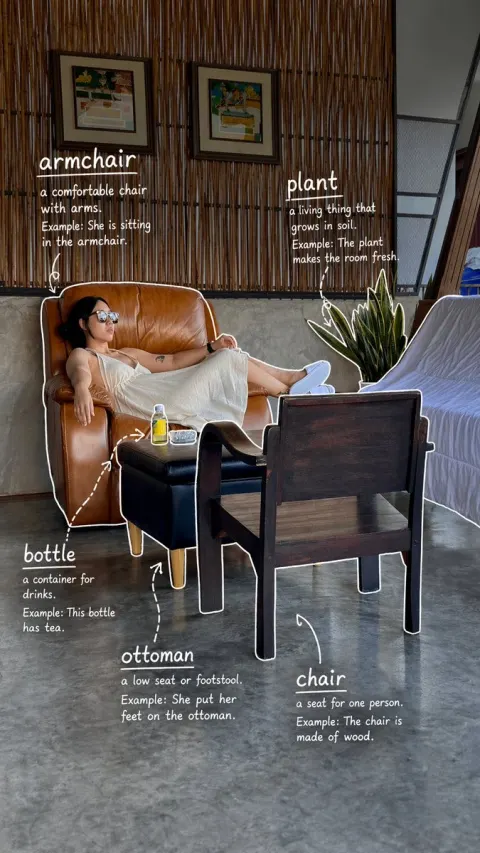
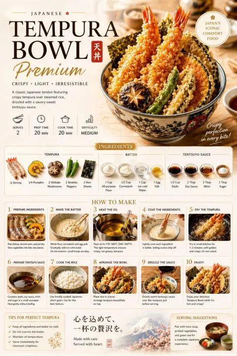
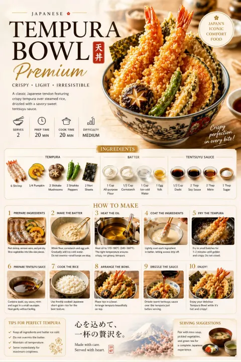
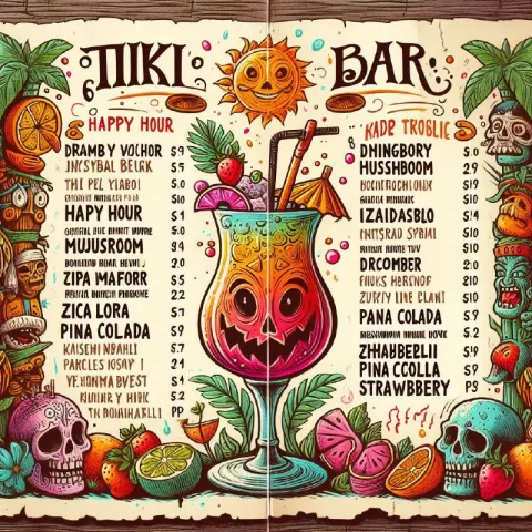
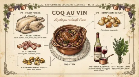
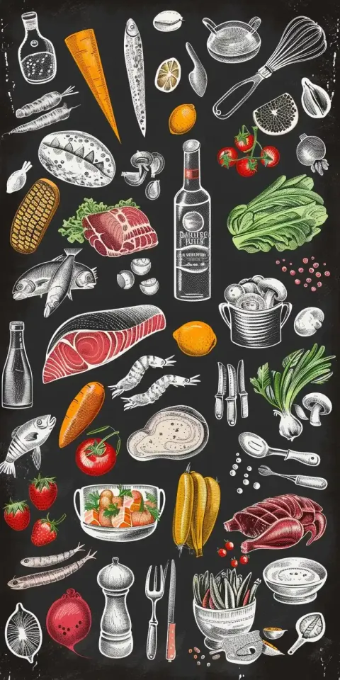
The overall style features authentic dish photo collages + white hand-drawn line annotations + relaxed and comfortable hand-drawn large headlines + exquisite brand menu layout. The background uses [[Main Color]] with [Background Material]], featuring delicate textures, soft light and shadow, and natural graininess, giving the whole look a high-end, clean, and high-quality feel.

Place a hand-drawn Chinese main title [[Main Title]] and an English subtitle [[English Subtitle]] at the top. The title should be relaxed, natural, and refined, with a handmade feel and not sloppy.

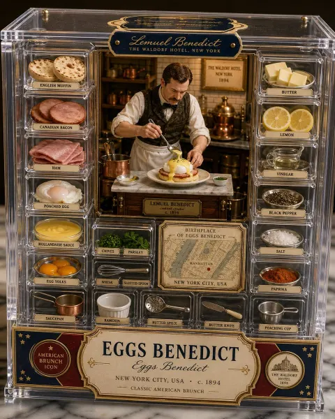
The center displays 1 main course + 4–5 supporting dishes, with [Main Course]] as the main visual focal point and [[Auxiliary Dishes]] distributed around it. Dishes should have a realistic photographic texture, natural shadows, clear ingredients, accurate tableware, and a clear hierarchical relationship.

Add a white hand-drawn dish name, English name, price, or flavor keywords next to each dish, and lightly label them with arrows, circles, short underlines, small dots, and small ingredient line art. Keep text within 2–3 lines, keep information not too dense, and use restrained and design-oriented lines.

Set up a clean brand section at the bottom, with [[Brand Name]] and the slogan [[Brand Slogan]]. The whole should look like a campaign poster for a new drink set—long, fresh, refined, and with a strong sense of social media communication.

Avoid: rough backgrounds, messy titles, overly dense information, distorted food, distorted plates, uneven shadows, uneven images, messy graffiti, low resolution, and cheap menu appearances.