GPT Image
Kirin Watermelon Luxury Gift Box
Title: Task: Design a high-end fruit e-commerce packaging proposal board for "Kirin Watermelon," themed "Qi Summer Courtesy," targeting mid-to-high-end urban households for gift-giving, corporate group buying, fresh food e-commerce...

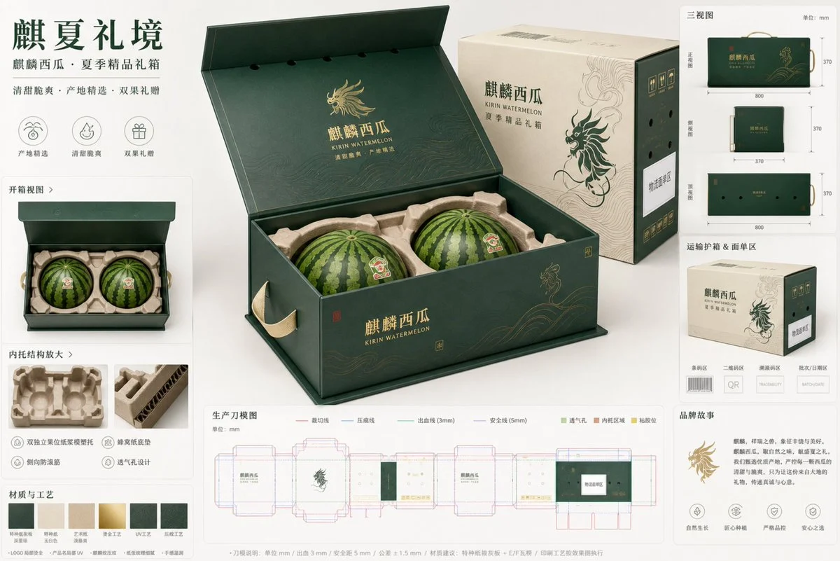
Prompt: Task: Design a high-end fruit e-commerce packaging proposal board for "Qilin Watermelon," themed "Qi Summer Gift Realm," targeting urban mid-to-high-end family gifting, corporate group buying, and fresh food e-commerce premium gift box scenarios. The output should be a professional, restrained, and realistic packaging proposal board, not just an ordinary advertising poster.

Brand positioning and audience: premium fresh fruit ecommerce gift packaging for Kirin watermelon, restrained luxury agricultural gifting, trustworthy, fresh, premium, modern Chinese aesthetic, audience includes urban families, summer seasonal gifting buyers, enterprise welfare procurement, boutique fresh-food ecommerce consumers.

Hero packaging structure: The center of the image features an oversized 45-degree hero package, occupying about 50% of the image. The packaging follows a "one-piece book-shaped flip-top gift box + external transport protective box" structural logic. The gift box is a horizontal rectangular block with stable proportions and crisp corners; when fully unfolded, the inner tray and double fruit positions are visible; The transport protective box appears as a secondary module on the side, neatly displaying its compression resistance, protection, and face strip area. The gift box handle should not have fragile holes; instead, it should be reinforced with a webbing handle or a hidden side carrying structure. The bottom structure must be thick, with a locking bottom or tray-type load-bearing logic. The entire packaging should not appear thin or cheap; it must have a realistic rigid board and corrugated structure thickness.

Fruit and inner tray logic: Qilin watermelon uses large fruit and heavy fruit, using a two-fruit package. Internally, it is a dual-independent fruit position array, using molded pulp insert / paper-pulp tray with contour support, each watermelon seated into a shaped cradle, with honeycomb-paper bottom cushion, top stabilizing ring, side anti-roll ribs, clear lid clearance, visible ventilation path. Fruits must not be suspended, squeezed together, or directly supported by the peel or collision. The unboxing module should clearly see two fruit positions, a limit ring, bottom buffer, extraction position, and ventilation path holes. A single cut-out watermelon can be added as a small auxiliary to emphasize category recognition but not overshadow the main feature.

Visual identity system: The overall style is high-end Eastern agricultural gift packaging, clean premium packaging board, modern Chinese typography mood, restrained composition. Main colors are dark dark green and jade white, supplemented by light vine yellow, accented with a small amount of watermelon flesh red and low-saturation hot stamping. The graphic language comes from "Qilin pattern abstraction + watermelon vine curve + summer wind field texture," but must be minimalist, orderly, suitable for large-area packaging, avoiding traditional complex Guochao stacking. Surface materials include special paper mounting grayboards, partial hot stamping logos, partial UV product names, and delicate embossing. The number of processes should be restrained, not exceeding three key effects. Paper texture, corrugated edge thickness, and molded paper tray fiber feel should all be clearly visible.

Proposal board composition: Uses Clean Studio Presentation Board, with a light warm white background with a slight jade-colored gradient. Besides the central hero package, 7 to 8 auxiliary modules are arranged in a modular grid around the perimeter:
1. Unboxing view: Displays the double-position internal tray structure after the flip lid is opened
2. Three-view drawing: small images of the packaging appearance on the front, side, and top
3. Enlarged internal tray structure: displays pulp tray, honeycomb base pad, top limit ring, and extraction hand position
4. Transport Protective Box Module: displays the outer protective box, waybill area, barcode area, and QR code space
5. Die Structure Diagram: production-intent dieline visualization, do not disguise it as a fully producible file
6. Materials and Craftsmanship swatches: Special paper, pulp tray, hot stamping, localized UV printing, and textured texture
7. Key Size Notes: Gift box outer dimensions, single fruit slot clearance, handle position, ventilation hole avoidance logic
8. Brand Story Small Module: Small display of the "Summer Premium Melon Gift" slogan and origin logo

Die Mold and Production Annotation: Place a readable but non-stealing dieline module at the lower right or bottom. Use standard legends to express: red solid cut line, blue dashed indentation line, green bleed line, purple safety line, light green vent hole, light brown inner tray buffer area, yellow adhesive position. Annotations should include clean modular annotations, unit mm, bleed 3 mm, safety margin 5 mm, finished-size tolerance +-1 mm, die-cut tolerance +-0.5 mm, print registration tolerance +-0.3 mm, logistics label zone, barcode placeholder, QR placeholder, traceability code placeholder, batch/date placeholder. Note that all code zones must be clearly labeled placeholder zones, not fake readable codes.

Lighting and lenses: Soft studio lighting, premium commercial packaging photography, realistic shadows, subtle reflections, balanced white background, sharp focus, high resolution, professional industrial design board, clean alignment, generous negative space, realistic scale, luxury ecommerce proposal board, landscape composition, 16:9 ratio. Hero packaging stands out, auxiliary modules are clear but smaller, and the whole is like a packaging concept board that truly reports to customers.

Packaging copy blocks: Try rendering short and clear packaging text in the image, avoiding dense long paragraphs.
It is evident that text is controlled to a small number of short words:
Brand main logo: Qilin Watermelon
English subtitle: KIRIN WATERMELON
Proposal Title: Summer Premium Gift Box
Auxiliary phrase: Sweet and crisp / Selected from the origin / Double fruit gift
Corner marker positioning: origin logo / variable information area / logistics waybill area / barcode area / QR code area
Please treat all text as short label typesetting, maintain a sense of sophistication and blank space, and avoid generating large, hard-to-read text.

Final Effect Requirements: Professional Premium Fruit Ecommerce Packaging Proposal Board, One Oversized 45-degree Hero Package, Photorealistic Paper and Corrugated Texture, Heavy-Fruit Protective Insert, Coherent Opening Structure, Realistic Ripid Gift Box Plus Shipping Sleeve Logic, Production-intent Dieline Visualization, Restrained Luxury Agricultural Brand Identity, Clean Technical Annotations, Physically Plausible Structure, Elegant High-End Chinese Packaging Presentation.