GPT Image
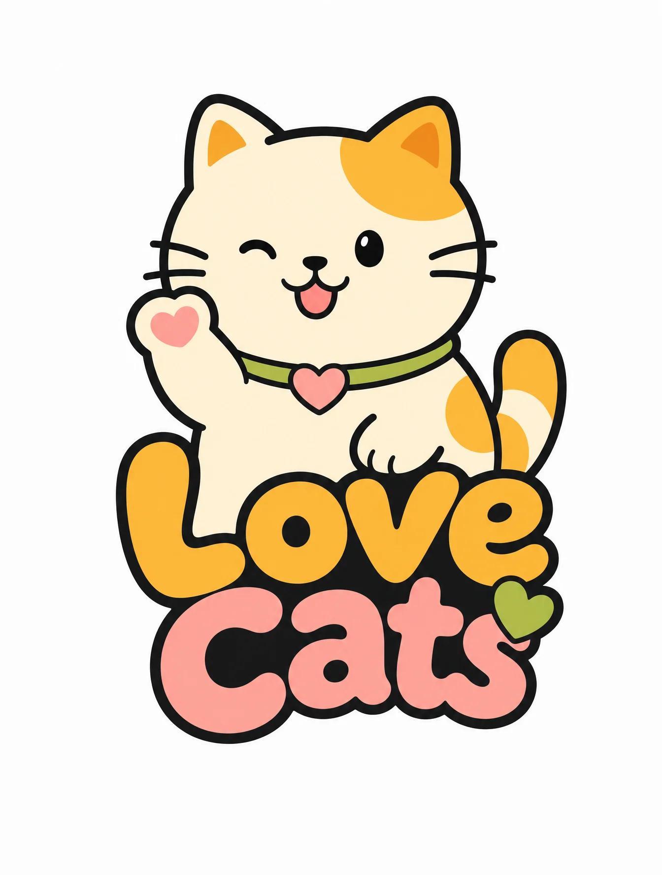
Love Cats Brand Logo Design
Main characters and graphics
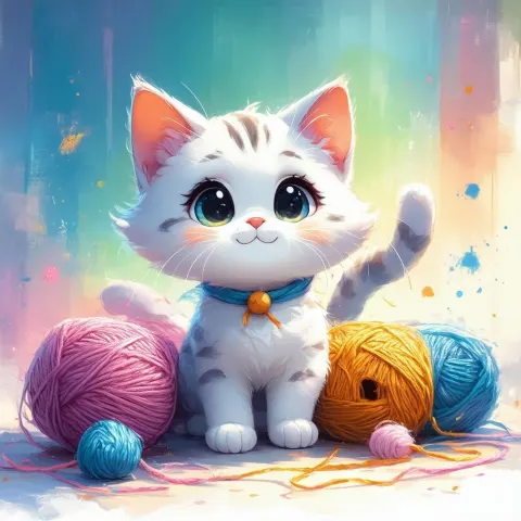
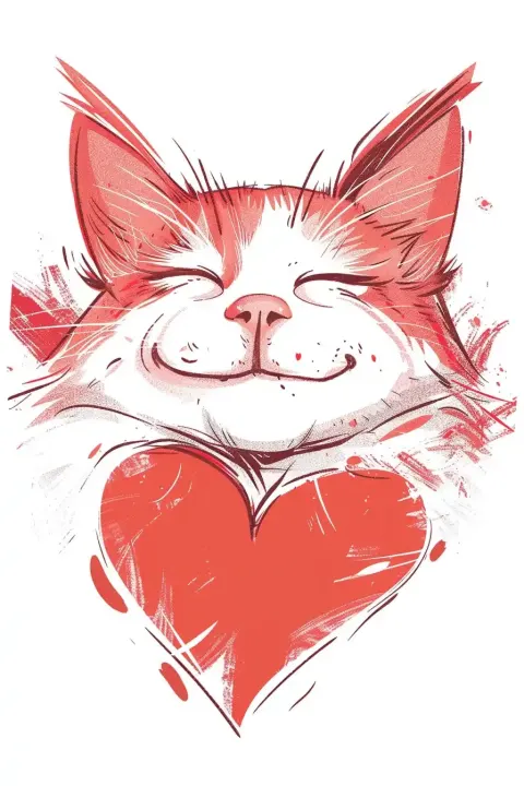
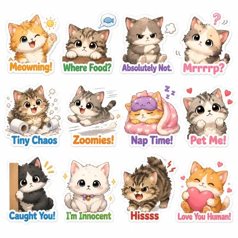
A rounded, highly memorable cartoon cat image with a simple geometric outline, vivid expressions, and a hint of relaxed playfulness. The cat design presents a subtle handmade feel and sticker style, with a unified thick black outline filled with flat, flat color blocks inside, ensuring high visual recognition.

Layout and font labeling
The graphic body is positioned at the top, paired with rounded, thick custom fonts below. The fonts have a handwritten feel and playful transformation, resulting in a compact overall structure. The brand name Love Cats naturally integrates with the graphics, forming a balanced visual whole suitable for various commercial application scenarios.

Color and texture
Adopt a bright and comfortable youthful color scheme, choosing cream, orange-yellow, grass green, and misty pink as the main tones. The overall color saturation is moderate, presenting a clean and fresh visual effect, avoiding dirty gray and glaring high-saturation colors, and avoiding any gradients or metallic textures.

Visuals and environment
With a pure white background and a centrally centered logo display, it presents a high-quality brand visual with strong commercial versatility and scalability.

Negative constraints
No distracting elements beyond text, watermarks, or logos. No gradients, no metallic sheen, no complex shadows. Main Figures Reject overly childish children's art styles and over-design. Ensure outlines are clean and sharp, with no broken or blurry pixels.