GPT Image
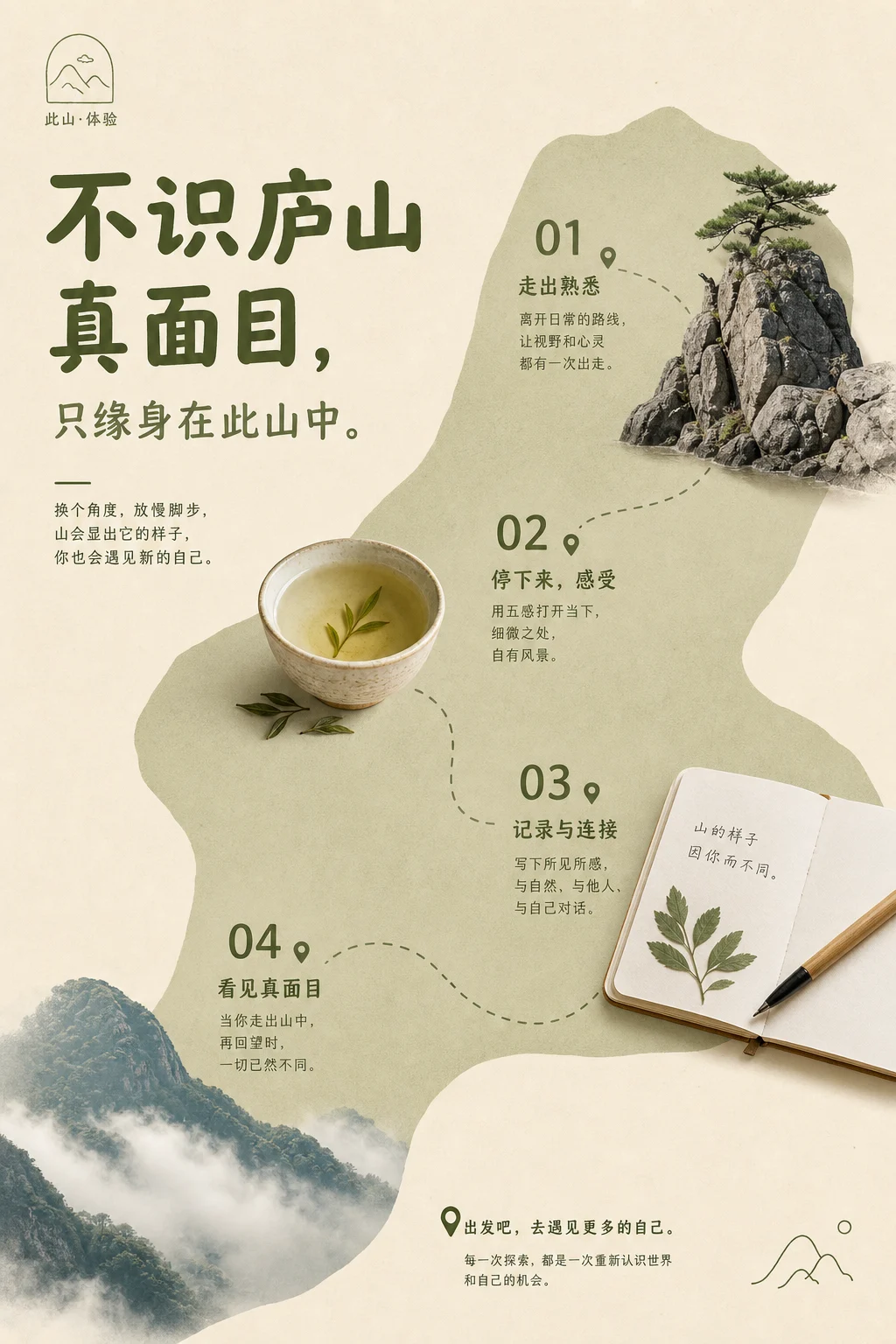
Lushan Poetic Brand Menu
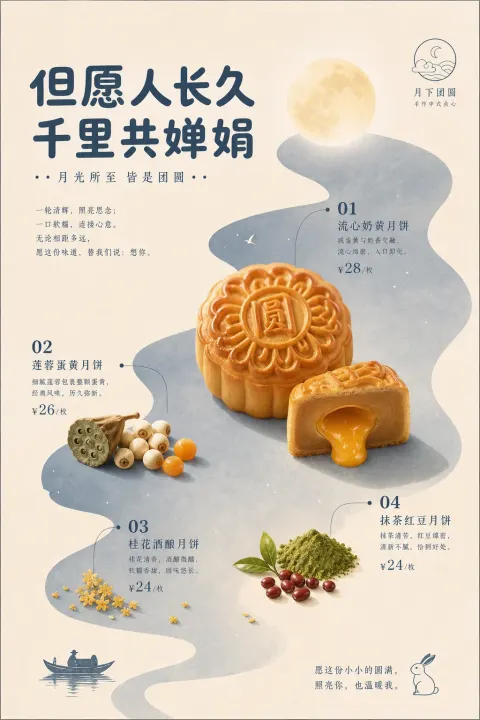
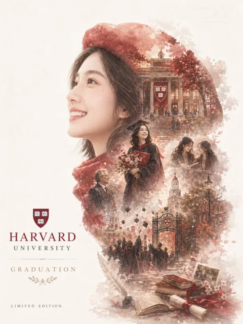
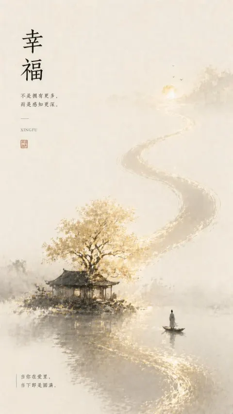
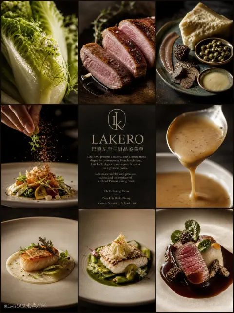
Generate a high-quality vertical print visual centered on specific themes, resembling a restrained yet friendly brand menu page. The composition first establishes a large area of warm paper background, preserving loose margins and breathable blank spaces; Then, from the source, path, material relationships, or emotional temperature of the theme, a soft-edged, irregular structural color field is derived, allowing it to run through the main area like the abstract terrain of the theme, carrying the background, reading route, and semantic unity, rather than ordinary decoration. The core subjects are pressed against the structural color field using clean photographic clippings or real material stickers, with clear outlines, partially crossing the edges of the field field, preserving only the most recognizable materials, highlights, textures, and shapes, with shadows so light they appear printed on the paper. Structural color occupies about a minor large area of the composition, with the most base color, and the brightest or most textured parts of the subject becoming the visual focus; Hues can vary with the theme, but it is essential to maintain a low noise level between a gentle base color, structural color of the subject, color of the main material, and a few emotional points. Text, numbers, small icons, and annotations use a monochrome system with the same structural color source. Titles are thick, rounded, and easy to read; key numbers are concise and prominent; explanatory text is fine and orderly, forming nodes close to the main body like menu notes, without border cards or multicolor labels. Information clusters are distributed along the path of the structural color field, allowing the gaze to naturally move from one main node to the next, and a brief closing sentence in the blank area completes the reading. A small linear logo or symbol can be placed in a quiet corner, restrained in scale, with colors of the same origin to confirm the theme meaning. The overall surface maintains a low-contrast print feel: clean flat coloring, soft paper surface, clear cutout edges, only slight contact with shadows, avoiding complex scenes, heavy 3D, strong gradients, or promotional stacking; Let the background space, authentic subject, monochrome text, and large blank spaces all come together to form a clean brand order handled by the same author. —————— This Theme: Not Seeing the True Face of Mount Lu, Just Because You Are Inside It: At least 4 highlights, attracting people and sparking participation in a ratio of 2:3 to impulse and ideas