GPT Image
Luxury Brand Product Visual Design
[BRAND NAME] + [PRODUCT]

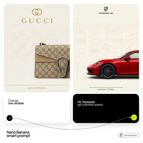
Act as a senior luxury fashion art director and studio product photographer creating a premium key visual for a flagship campaign, an e-commerce editorial, and mobile-first brand content.

PHASE 1: FORMAT AND CANVAS

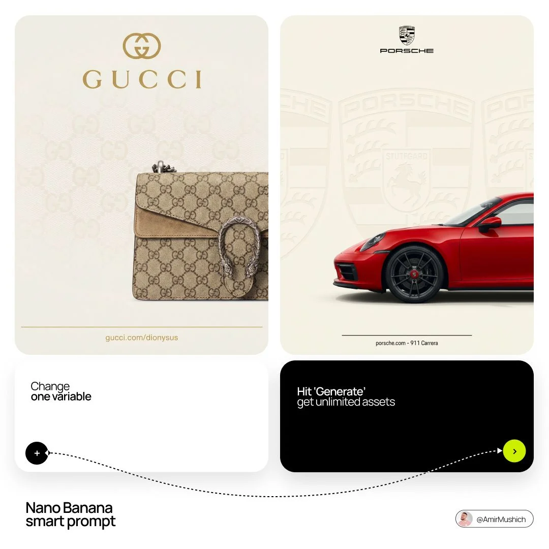
Create a vertical 9:16 composition. Use a single, completely flat warm off-white background, never pure white and never gray. Aim for a soft ivory cream similar to #F4EFE6, with no visible shadowing across the background plane.

Automatically infer the signature neutral background tone associated with [BRAND NAME]. If the brand is known for a house color used in packaging, tissue paper, lookbooks, or campaign materials, subtly shift the canvas toward that recognized off-white or neutral. The final image should feel like an official brand asset, not a generic studio render.

PHASE 2: BACKGROUND PATTERN WATERMARK

Identify [BRAND NAME]'s iconic surface language, such as its monogram, toile, geometric logo repeat, heritage emblem, archival motif, or signature textile pattern.

Apply that pattern across the full background as a ghosted watermark. Keep it tone-on-tone, using the same base color family with a slight value difference of roughly 8 to 12 percent lighter or darker than the canvas. Make the pattern large in scale, with individual motifs taking up about 15 to 25 percent of the canvas width. Keep opacity between 10 and 18 percent. Avoid hard outlines. The pattern should feel embossed, woven, or softly pressed into the surface rather than printed. It must sit behind every foreground element.

PHASE 3: LOGO PLACEMENT

Recreate [BRAND NAME]'s official logo with high fidelity, including accurate letterforms, proportions, secondary marks, emblems, crowns, stars, monogram icons, or other brand-specific details.

Place the logo horizontally centered in the upper third of the frame, within the top 30 percent of the canvas. Scale it so it spans about 40 to 50 percent of the canvas width. It should be prominent, clean, and balanced.

Render the logo as flat 2D artwork with no extrusion, chrome, beveling, or dimensional effects. Use the official logo colorway for [BRAND NAME], matching the brand-standard color or colors seen on official packaging and websites. If the logo uses separate tones for an icon and wordmark, preserve that hierarchy precisely.

Directly beneath the main logo mark, add the full [BRAND NAME] wordmark in widely tracked capital letters. Use a clean geometric sans-serif style, tracking around +200 to +300, in the same brand color. The wordmark height should be about 60 percent of the main logo height. Do not place decorative dividers or extra symbols between the logo and wordmark.

PHASE 4: PRODUCT PLACEMENT

Render [PRODUCT] as a photorealistic studio object with maximum material accuracy.

Leather should show grain, pores, stitching texture, edge paint, and natural surface variation. Metal hardware should be gold or silver as appropriate, with believable micro-reflections and no flat coloring. Canvas, textile, and fabric should show woven fiber detail rather than smooth synthetic surfaces. Any brand-specific patterns on the product itself must be accurate, sharp, and legible.

Place the product so it enters from the bottom-right corner at a natural 25 to 35 degree angle, as if casually placed into frame or captured mid-motion. Crop the object intentionally so only about 60 to 75 percent of it is visible. The product should occupy the lower 55 to 65 percent of the image. The crop must feel editorial and intentional, not accidental.

Make the product feel physically present on the surface. Add an extremely soft contact shadow under the nearest edge, around 8 to 12 percent opacity. Do not use hard drop shadows.

PHASE 5: LIGHTING

Use the feeling of a large north-facing studio window. The light should be soft, directional, and almost shadowless on the background. Use neutral daylight between 5500K and 6000K, slightly cool but still natural.

Set the key light as a large softbox from the upper-left, evenly revealing the entire product surface. Keep contrast very low, roughly 1.2:1 to 1.5:1 maximum. Add a broad fill from the right to remove harsh shadows. Do not use rim light. Do not create dramatic contrast. The lighting should only reveal the product, never compete with it.

Enable subtle global illumination so product surfaces reflect onto one another naturally. Avoid specular hotspots on leather. Reserve crisp highlights mainly for metal hardware.

PHASE 6: TYPOGRAPHY AND FINISHING

At the bottom of the frame, place a thin horizontal rule, 1 px thick, centered, spanning about 80 percent of the canvas width, using the brand color. Beneath it, add one line of micro-copy in the same clean sans-serif family. It may be a social handle, collection name, campaign label, or small-caps editorial caption. Generate a contextually appropriate label for [BRAND NAME]. Keep it minimal, refined, and brand-correct.

TECH SPECS

Render as photorealistic CGI with the polish of Keyshot or Octane product visualization. Use ultra-high detail in a 9:16 vertical frame. Simulate f/16 depth of field so everything remains tack sharp. No bokeh. Product edges, stitches, patterns, hardware, and surface details must be crisp.

Use clean true-to-life tone mapping with no crushed shadows, no vignette, no grain, and no cinematic haze. Keep colors faithful to the real product, with only slight warmth in the ivory background. Avoid AI-plastic leather, fake normals, smooth fabric, reflective backgrounds, and environmental reflections. Use only controlled studio lighting. The mood should match the standard of official Louis Vuitton, Bottega Veneta, and Celine e-commerce or campaign photography: clean, premium, precise, and ready for press use.