GPT Image
NEWT Travel Begins
Title: You are a top-tier advertising creative director, art director, travel photographer, editorial...

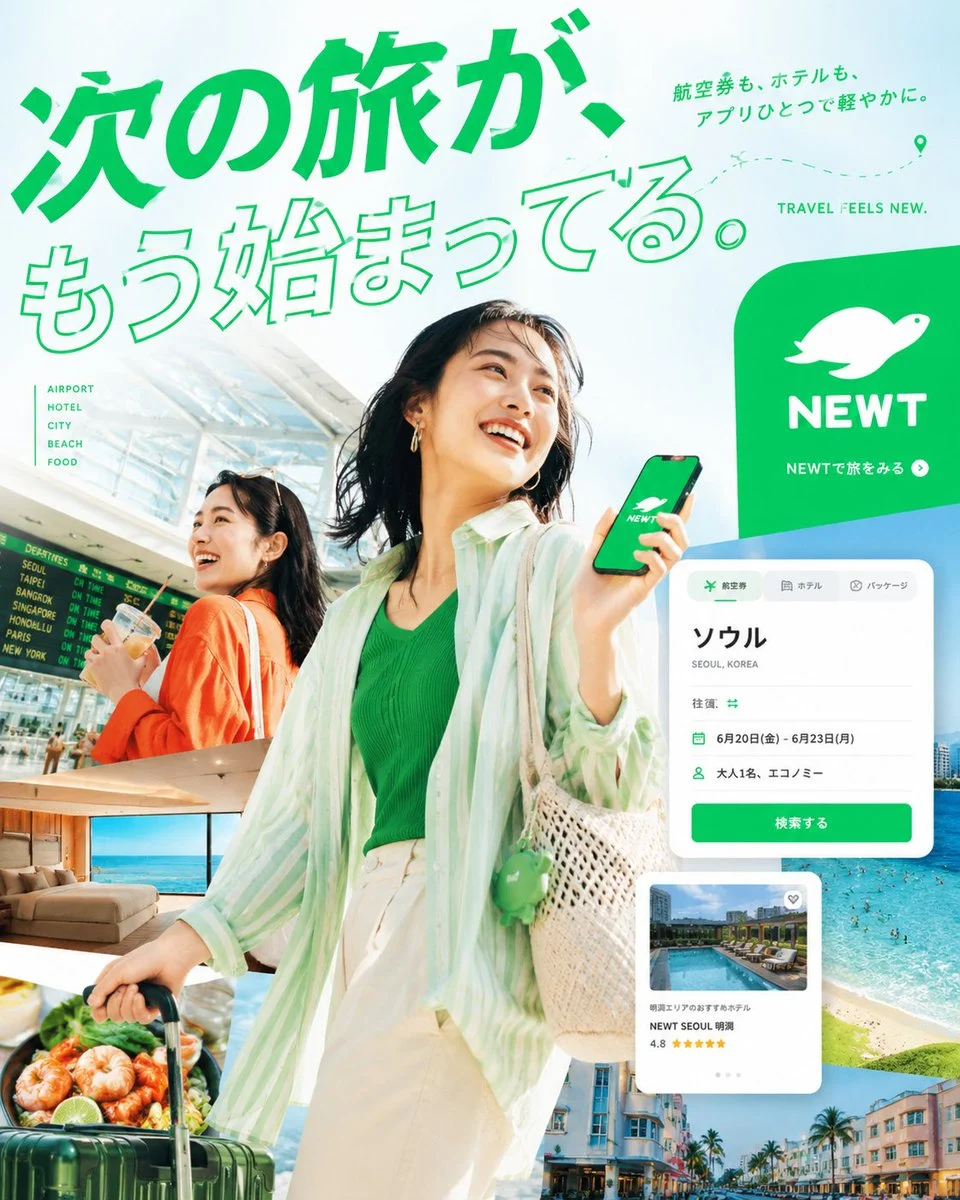
Prompt: You are a top-tier advertising creative director, art director, travel photographer, editorial designer, and expert in Japanese typography.

Be sure to use the attached NEWT logo and create a high-quality, 4:5 portrait live-action editorial poster that works as a NEWT travel app ad.

The goal of this poster is not simply to create beautiful travel advertisements.
After just a brief glance on my smartphone, I stopped my gaze and said to the viewer,

* Makes you want to travel
* I feel I like this worldview
* Makes you want to continue on NEWT

Let me feel that way.

⸻

1. Overall Screen Tone

The overall impression should be bright / transparent / high saturation / urban / refined.
While using NEWT Green as the base, effectively add one or two vivid colors such as sky blue, turquoise, sunset orange, or fluorescent yellow.

Please avoid the following directions.

* Dark, indoor centered screen
* Gray base gives a sunken impression
* Looks like an affordable package tour advertisement
* Layout like old travel flyers

⸻

2. Photographic Expression and Character Design

The core of the ad is high-quality, live-action travel visuals.
Strongly integrate the following elements within a single poster.

* Travelers
* Airports
* Hotels
* Urban scenery
* Sea
* Food
* App experience on smartphones

Please make up your characters as Japanese or East Asian fictional models.
You don't have to look like a celebrity. Emphasize natural expressions, natural skin, and natural hand expressions.

Avoid ordinary work clothes or casual outfits, but styling that stands out as a travel advertisement.
Ideally, it should convey the excitement of traveling and the urban, sensitive lifestyle.

⸻

3. Composition should be "boldly transformed"

Don't use the usual ads where you simply place people, text, or logos as usual.
This poster should have a composition that is memorable in terms of shape itself.

We especially welcome designs such as the following:

* Use the silhouette of the NEWT turtle logo as a giant frame or die, unfolding travel scenes within them.
* Boldly divide the screen into large circles, waveforms, ticket types, app card types, map lines, and more
* Instead of arranging photos in simple rectangles, organize them with diagonals, curves, croppings, and overlapping
* Throw huge Japanese typography onto photos, creating momentum as if part of the text is cut off the screen
* Naturally overlay smartphone UI, airline tickets, hotel cards, map pins, and flight lines as graphic elements
* Avoid safe left-right divisions; always create discomfort when your gaze stops due to misalignment, margins, trimming, or overlapping

⸻

4. Copy you must include

Main copy

The next journey has already begun.

subcopy

Fly tickets and hotels all with a single app for a light and effortless experience.

CTA

Travel with NEWT

small English letters

TRAVEL FEELS NEW.

⸻

5. Handling of Characters

For this poster, design Japanese typography as the most important visual element.
Don't just have the text read aloud; aim for the text itself to become the main character of the screen.

The following actions should be avoided:

* Simple headings with just white text
* Processing is simply by simply importing a ready-made font
* Looks like Canva templates
* First-view LP processing
* Cheap ways to look like discount banners

The recommended text processing is as follows.

* Huge outline text
* Extra-thick Gothic
* Lengthy body processing
* Combination of vertical and horizontal layout
* Tailoring
* Embedded in the photo
* Integration of typography, people, scenery, and UI

⸻

6. How to Use the Logo

Be sure to use the NEWT logo.
However, rather than simply sticking it in the corner, it should naturally function by blending seamlessly into the overall structure of the poster.
While the brand needs to be recognizable, avoid situations where only the logo stands out and stands out.

⸻

7. Ultimate Goal for Perfection

The finished product should be of quality that balances the following elements.

* Urban travel campaign advertisements
* Travel feature cover in a highly sensitive culture magazine
* Season visuals of airlines
* High-quality advertising expressions for hotel brands

In other words, make your travel ad bright, sophisticated, budget-friendly, and highly editorial.

⸻

8. NG Items

Absolutely do not go in the following directions.

* Looks like a budget travel flyer
* An atmosphere reminiscent of information product banners
* An unnatural AI beauty with a strong vibe
* Business attire that is too ordinary
* Visuals focused on dark interiors
* A structure that emphasizes price appeals
* Hard-to-read, distorted Japanese
* Amateur-like layout with photos and text scattered
* Extremely safe left-right split composition