GPT Image
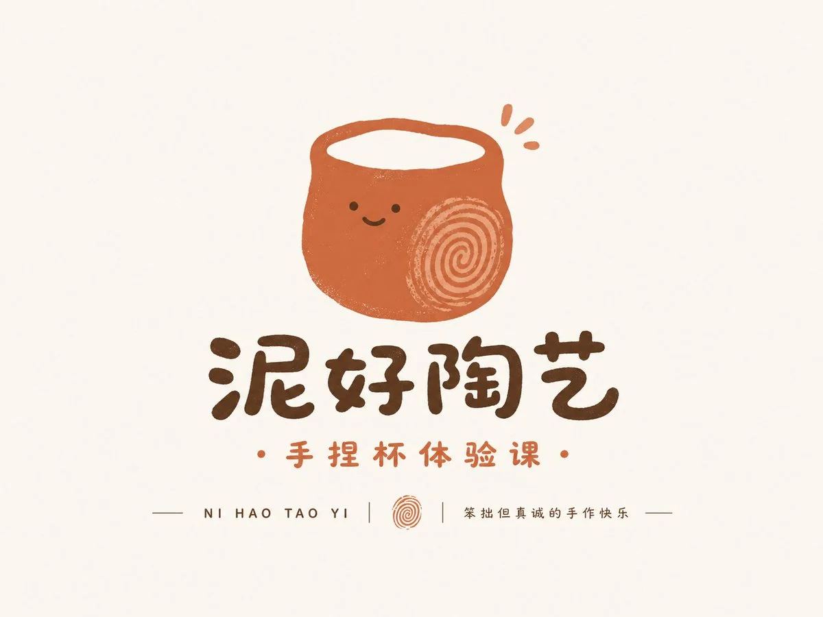
Playful Graphic Logo Design Showcase
Title: Please use the [Brand Name][Product Name], [Brand Type/Industry], [Brand Positioning], [Target Audience], [Keywords], [Main Color Tone], [Aspect Ratio]...

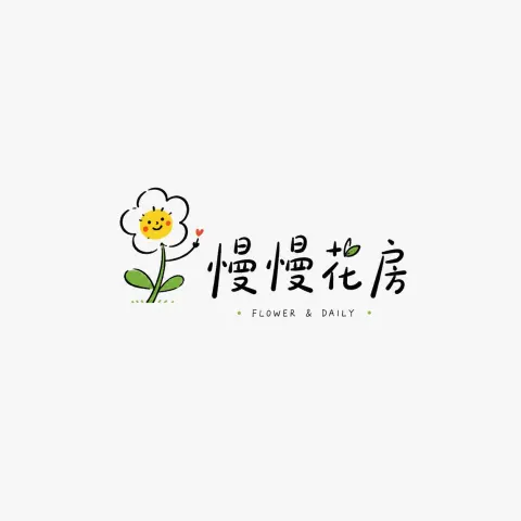
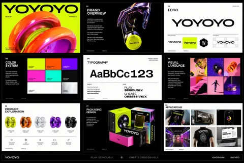
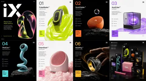
Prompt: Based on the user's input of [Brand Name], [Product Name], [Brand Type/Industry], [Brand Positioning], [Target Audience], [Keywords], [Main Color], and [Aspect Ratio], create a highly completed 'Playful Graphic Marks' style logo display image.

[User Input]
Brand Name: [Brand Name]
Product Name / Project Name: [Product Name]
Brand Type / Industry: [Brand Type / Industry]
Brand Positioning: [Brand Positioning]
Target audience: [Target audience]
Style keywords: [Keywords]
Main Tone: [Main Tone]
Secondary Color: [Auxiliary Color]
Aspect ratio: [aspect ratio]

[Creative Objectives]
This is not ordinary text layout, not a complicated illustrated poster, nor a traditional serious corporate logo, but a "fun graphic logo display image" with strong recognition, fun, approachability, creativity, and brand presence.

Based on the information entered by users, first determine which direction of playful expression is best suited for this brand, and then design the logo accordingly:
1. If the brand leans more towards handmade, light cultural and creative products, small shops, coffee, and a relaxed, casual vibe, it leans toward the "hand-drawn fun type";
2. If the brand leans more towards pets, children, snacks, IP, trendy toys, or cute consumer goods, then it leans toward "cartoon characters/animal types";
3. If the brand leans towards new consumption, dining, lifestyle, or retail brands and wants a simpler and more professional look, it prefers the "minimalist graphic commercial type."

Whichever preference you choose, you must remain within a unified 'fun graphic logo' system: simple, easy to remember, creative, approachable, and brand recognizable.

[Core Visual Requirements]
1. Use the [brand name] or [product name] as the core inspiration to distill a fun graphic logo with brand recognition.
2. The logo should prioritize "graphic recognition"; it does not have to be a pure text logo; it can also be a combination of text and graphics, or a more symbolic graphic mark.
3. Graphics should revolve around brand attributes and can creatively translate by combining product features, industry attributes, name associations, and brand personality.
4. The graphics should be simple and clear, not complicated illustrations; They should look like a logo that can truly be used for brand identification, packaging, storefronts, social media avatars, and peripheral materials.
5. The overall temperament should be interesting, lively, approachable, and memorable, but it should not be childish, messy, or too ordinary.
6. If a brand is suitable for character-based expression, it can incorporate animals, personifications, mascots, emotional expressions, and a sense of small characters; If a brand is better suited for simple expression, it can be condensed into a more geometric and regular graphic language.
7. The artwork can have a slight hand-drawn, cartoonish, or graphic feel, but the final result must be clean, mature, and unified.

[Style Judgment Logic]
Please use the input information to automatically match the most suitable performance mode:
- Warm, handmade, relaxed, small but beautiful: Use hand-drawn graphic language for fun
- Cute, pets, children, snacks, characterization: using cartoon characters and animal graphic language
- Modern, branded, commercialized, and commercial applications: using minimalist graphic commercial language
But don't directly write classifications like "hand-drawn fun" / cartoon / commercial in the image; just reflect them in the final visual result.

[Color Requirements]
1. Colors should automatically match according to brand attributes, keeping the overall look interesting, bright, and easy to recognize.
2. Prioritize using [main tone] and [auxiliary color], and optionally add a small amount of accent color.
3. The colors can be bolder than those of Chinese logos, but not chaotic; usually keep 2–4 main colors within them.
4. You can choose based on the brand's temperament whether it is bright and fresh, warm and cute, or low-saturation with a playful and sophisticated feel.
5. The background should be as simple and clean as possible; white, off-white, light gray, or light color backgrounds can be used to highlight the main logo body.

[Structural and Layout Requirements]
This image is a "logo display image," not an advertising poster. Please use a clear, professional, and reusable display structure:
- Main Visual Area: Place the main logo as the main visual center
- Name Area: Place brand or product names
- Sub-information area: can display pinyin, English name, short slogan, and industry description
- Detail Area: Small amounts of auxiliary small text, decorative lines, and marking information can be added to enhance the display of the artwork

[Layout Requirements]
1. The layout should remain simple overall, with comfortable blank space and focused visual focus.
2. Layout can be centered, top-bottom, or light proposal display.
3. The main logo is the largest, followed by the brand name, with little other information.
4. Don't pile up too much information, and don't make it look like a promotional poster.
5. The image should resemble a highly completed logo display image from a design portfolio.

[Overall Temperament Keywords]
Fun, graphic, approachable, creative, concise, recognizable, brandable, relaxed, dynamic, and highly memorable—suitable for social media communication and brand display.

[Output Requirements]
Please ultimately generate a highly polished, fun graphic logo display image. The key is not complexity, but making the logo recognizable, interesting, and matching your brand positioning.