GPT Image
Retro Japanese Mini Eraser Product Packaging
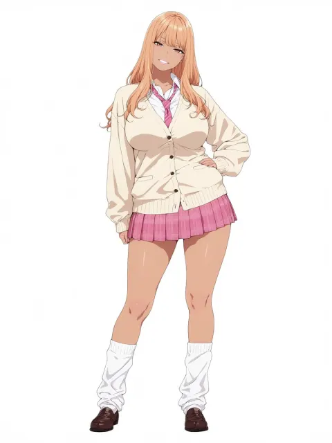
Use the attached character sheet as a STRICT design reference. Never change the character's face, hairstyle, eye shape or proportions.

Purpose:
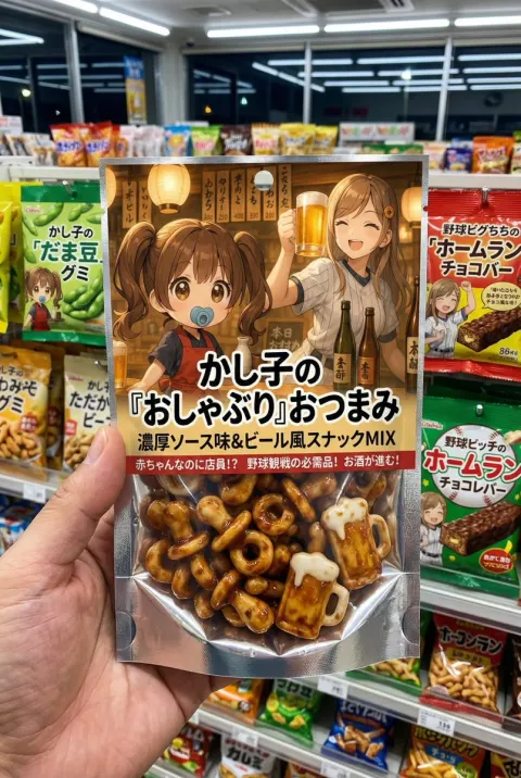
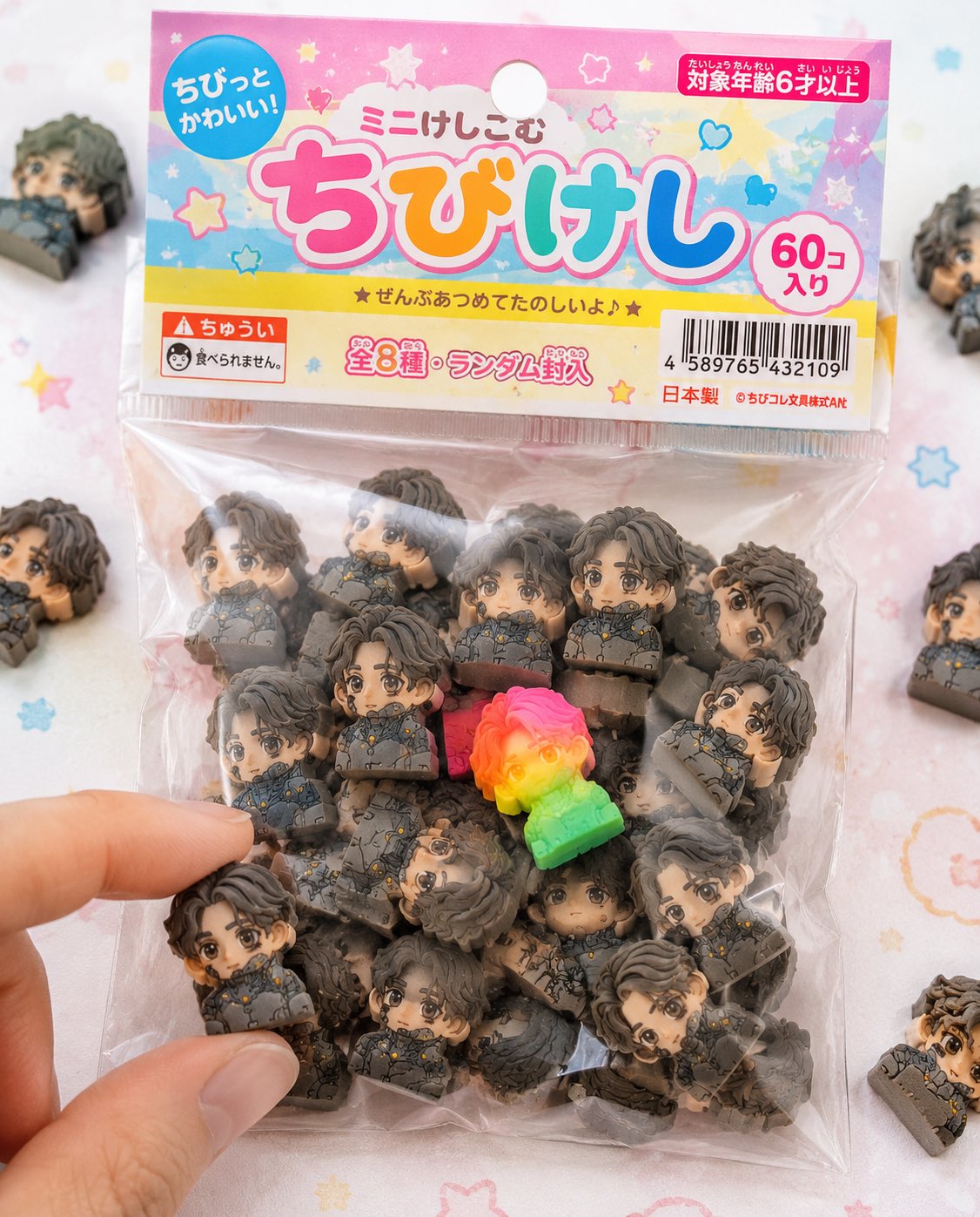
Turn the character completely into a Japanese "chibi eraser product" and create a realistic packaged product photo like the ones actually sold in stationery sections or gacha machines.

Concept:
"Bagged chibi erasers sold at a 100 yen shop or a stationery store"

Eraser itself:
(the same specification as last time, fully maintained)
- Strongly deformed chibi character
- Thick block shape
- Completely matte rubber material
- Fine particles, powder, shavings and wear
- Printing misalignment and color variation
- More than 50 pieces in a random arrangement

Packaging (extremely important):
- A small transparent plastic bag (OPP bag)
- A paper header at the top (with a hole for hanging)
- The header is printed a little cheaply (slight misalignment, uneven ink)
- The plastic is wrinkled, slightly cloudy, and clings to the contents with static
- Part of it is puffed up with trapped air
- The sealed part is slightly creased

Graphic design:
- Design in the style of Japanese stationery for children
- Pop and colorful (pink, yellow, light blue base)
- Handwritten style fonts and rounded lettering
- A product name logo (original is fine)
- Wording such as "ミニけし" (mini eraser) or "ちびけし" (chibi eraser)
- Star, heart and sparkle decorations

Information elements (to strengthen realism):
- JAN code (barcode)
- "対象年齢6才以上" (for ages 6 and up)
- A "食べられません" (not edible) warning
- "全◯種" (◯ types in total) or "ランダム封入" (randomly packed)
- A small company name (fictional)
- MADE IN JAPAN or CHINA marking

Composition:
- The package is the main element, in the center of the frame
- A few erasers spilled around it
- One or two are out of the bag
- A fingertip is about to pick one up
- Part of it goes out of frame for a natural feel

Rare element:
- Mix in one special piece in a fluorescent color or gradient
- Place it in a prominent position to guide the eye

Lighting:
- Bright natural light (slightly high key)
- Soft shadows
- The cleanliness of product photography

Camera:
- Close to macro
- Shallow depth of field
- Sharp at the center

Background:
- A white to pastel table
- A faint dot or pop pattern
- Simple and clean

Forbidden:
- A plastic look
- Glossy rendering
- Textures that are too luxurious (looking cheap is correct)
- Printing that is too perfect

Output:
- At a level where it can only be seen as a real product
- The realism of something you would find in a convenience store or a 100 yen shop
- A finish that makes people on social media think "I want this"