GPT Image
Tropicana Lifestyle Flavor Emblems Campaign
Title: Create an ultra-premium four-panel advertising campaign b...

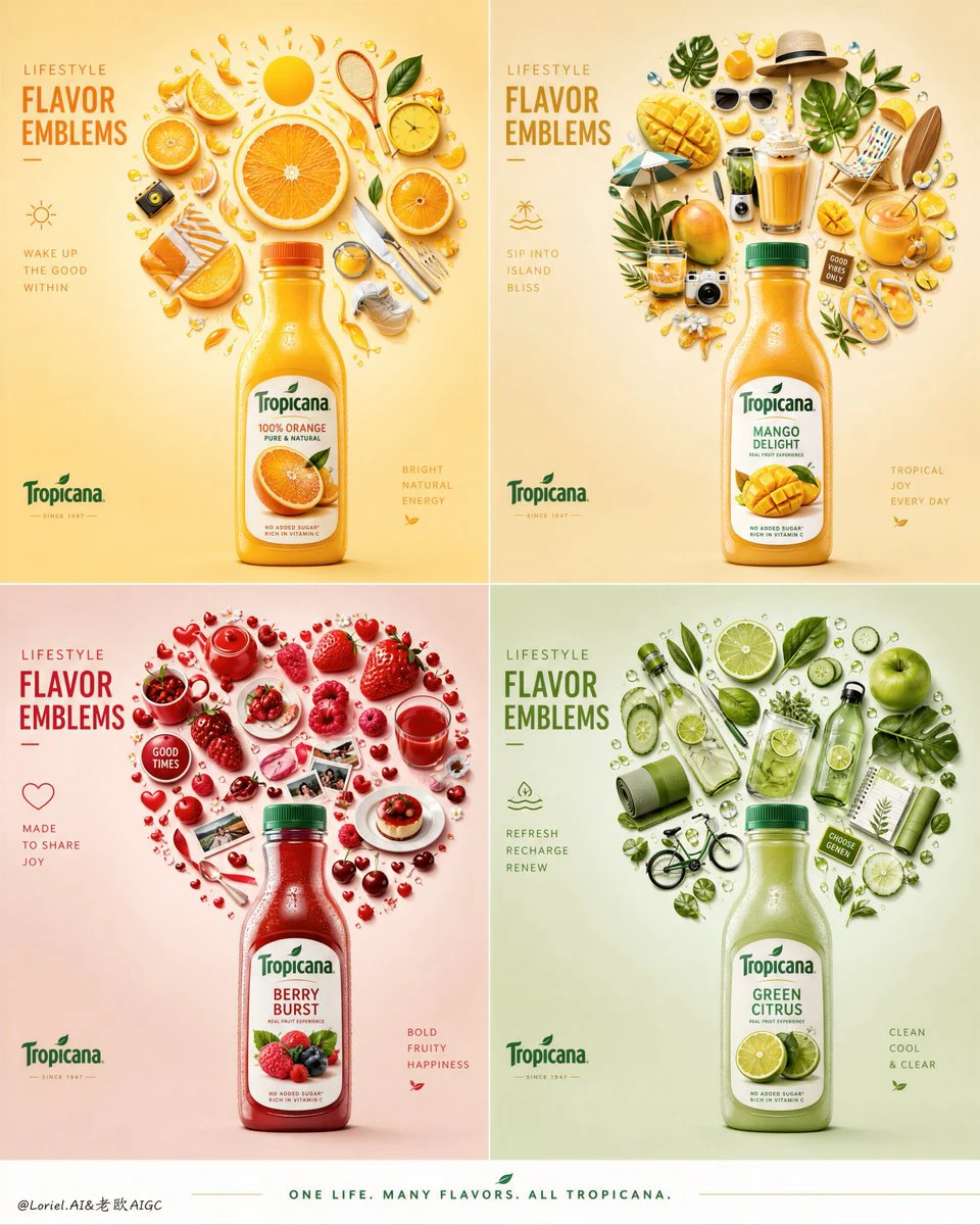
Prompt: Create an ultra-premium four-panel advertising campaign board for the Tropicana multi-flavor series, developed as the “Lifestyle Flavor Emblems” version. The composition must use a clean 2x2 layout where each panel presents one real front-facing Tropicana bottle and one large emblem-like sticker composition above it, built from flavor-related lifestyle objects, fruit elements, and daily-life mini icons. The final campaign must feel intelligent, elegant, playful, and highly organized, like a world-class global beverage identity system where every flavor becomes its own symbolic lifestyle badge. The image must feel bright, fresh, hyper-real, and extremely refined, while keeping the product heroized and clearly readable in every panel.

Core concept:
Each Tropicana flavor becomes a lifestyle emblem. Rather than only showing fruit and color, each panel must transform daily-life objects, fruit slices, utensils, cups, leaves, leisure items, breakfast accessories, and small flavor-linked objects into one carefully composed “life badge” above the bottle. These emblems should feel less like random collages and more like elevated symbolic medallions or flavor crests, each with a distinct emotional world. The real product bottle anchors the composition at the bottom, while the emblem above acts as the lifestyle signature of that flavor.

4-panel structure:
Use a clean 2x2 campaign board with four equal panels and strong consistency in layout logic:
upper zone: one large emblem-like composition made from sticker-style lifestyle objects,
lower center: one front-facing real Tropicana bottle,
clean flavor-specific background,
minimal premium typography structure.
All four panels must clearly belong to the same campaign family, but each must tell a different flavor story through color, object choice, and emblem shape.

Panel 1, orange sunrise emblem:
Place a real front-facing Tropicana orange bottle at the lower center. Above it, build a large citrus-lifestyle emblem from orange slices, peel curls, fresh leaves, breakfast glassware, morning utensils, sunny round objects, juice droplets, tiny sport-leisure accessories, and bright daily-life symbols. The final emblem should feel like a polished sunrise crest or radiant circular badge, communicating active mornings, brightness, and natural energy.

Panel 2, mango tropical leisure emblem:
Place a real front-facing Tropicana mango or tropical flavor bottle at the lower center. Above it, create a rich tropical-lifestyle emblem built from mango pieces, yellow fruit rounds, beach-like leisure objects, smoothie tools, soft summer accessories, tropical leaves, cups, and warm casual-lifestyle stickers. The shape should feel like a tropical crest, relaxed vacation symbol, or sun-soaked leisure emblem, elegant and playful.

Panel 3, berry social emblem:
Place a real front-facing Tropicana berry or red fruit bottle at the lower center. Above it, build an emblem from strawberries, raspberries, cherries, red fruit slices, cups, mini plates, dessert-like accents, ribbons, social-lifestyle items, and playful red daily-life objects. The final badge should feel more vibrant and emotional, like a juicy social emblem for fun, sharing, and lively flavor energy. The silhouette can be softly rounded, fruit-like, or heart-inflected while staying premium and clean.

Panel 4, green refresh emblem:
Place a real front-facing Tropicana green citrus or mixed green flavor bottle at the lower center. Above it, create a fresh-lifestyle emblem from lime slices, green leaves, wellness objects, summer drink accessories, clean kitchen details, glassware, and cool refreshing mini icons. The final shape should feel crisp, balanced, and revitalizing, like a leaf-crest or freshness medallion linked to active clarity and cool uplift.

Emblem object logic:
The emblem compositions must feel carefully curated and flavor-specific. Every object should contribute both visually and emotionally to the taste identity of that panel. They should read as premium “lifestyle stickers” or collectible cutouts, but rendered with real material behavior, subtle thickness, refined shadows, soft tactile surfaces, and elegant spacing. The emblem silhouettes must be immediately readable at a glance while rewarding close inspection with object detail and flavor storytelling.

Product realism:
Render every Tropicana bottle with absolute realism and premium beverage fidelity. Each bottle must face directly toward the camera, clearly readable, physically accurate, and fully aligned with its panel flavor. Show bottle geometry, cap design, label hierarchy, transparent container behavior, subtle reflections, realistic juice color, and fresh premium product appeal. The products must feel cold, bright, and globally branded, anchoring the playful emblem systems with commercial realism.

Backgrounds:
Each panel must use a clean minimal flavor-specific background with soft premium color tone and excellent negative space. Suggested direction:
orange panel: pale citrus yellow or warm cream,
mango panel: soft tropical beige or mellow gold,
berry panel: blush cream, soft rose, or warm neutral,
green panel: pale mint, sage, or cool green-gray.
The backgrounds must remain calm and clean so the emblem and bottle dominate clearly. Avoid visual clutter or harsh contrast.

Typography:
Use an elegant overseas-product typography system with a large English-led campaign title and restrained supporting copy. The typography should be minimal, premium, and integrated without overpowering the products or emblems.
Main campaign direction:
“LIFESTYLE FLAVOR EMBLEMS”
Panel-level copy can remain short and elegant if desired.
Add only subtle official-style logo marks and minimal supporting English copy. Typography must feel clean, contemporary, and globally premium, never crude or heavy.

Lighting:
Use soft high-end commercial lighting with delicate shadows and refined object separation. Every bottle should be lit with premium product-photography precision. Every small sticker object inside the emblem should show real surface behavior, gentle shadow casting, and clear tactile form. The whole board must feel polished, bright, collectible, and physically real, while still keeping the clean graphic discipline of a campaign identity system.

Color direction:
Use a premium color-coded palette across the full board, with each panel tuned to its flavor identity while maintaining overall harmony. The campaign should feel colorful but controlled, bright but elegant, playful but luxurious. Let fruit tones, object tones, and background tones all support the same flavor logic without becoming too noisy.

Mood:
playful, premium, organized, fresh, collectible, lifestyle-driven, graphic, modern, colorful, tactile, hyper-real, elegant, internationally refined

Rendering style:
ultra-premium Tropicana multi-flavor campaign board, 2x2 layout, real front-facing juice bottles, lifestyle emblem sticker compositions, flavor-coded modern badges, clean pastel backgrounds, minimal premium typography, hyper-real product photography, world-class advertising key visual, 8k, global campaign quality

Negative prompt:
messy collage, weak product dominance, cheap sticker design, inconsistent flavor colors, cluttered layout, cartoon rendering, muddy palette, ugly typography, low-detail bottle realism, random objects, low-end poster design, flat lighting