GPT Image
Velox NMN Comparison Ad Design
Title: Create a 4:5 vertical static ad graphic (1080x1350px) for...

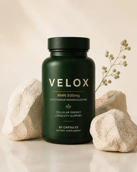
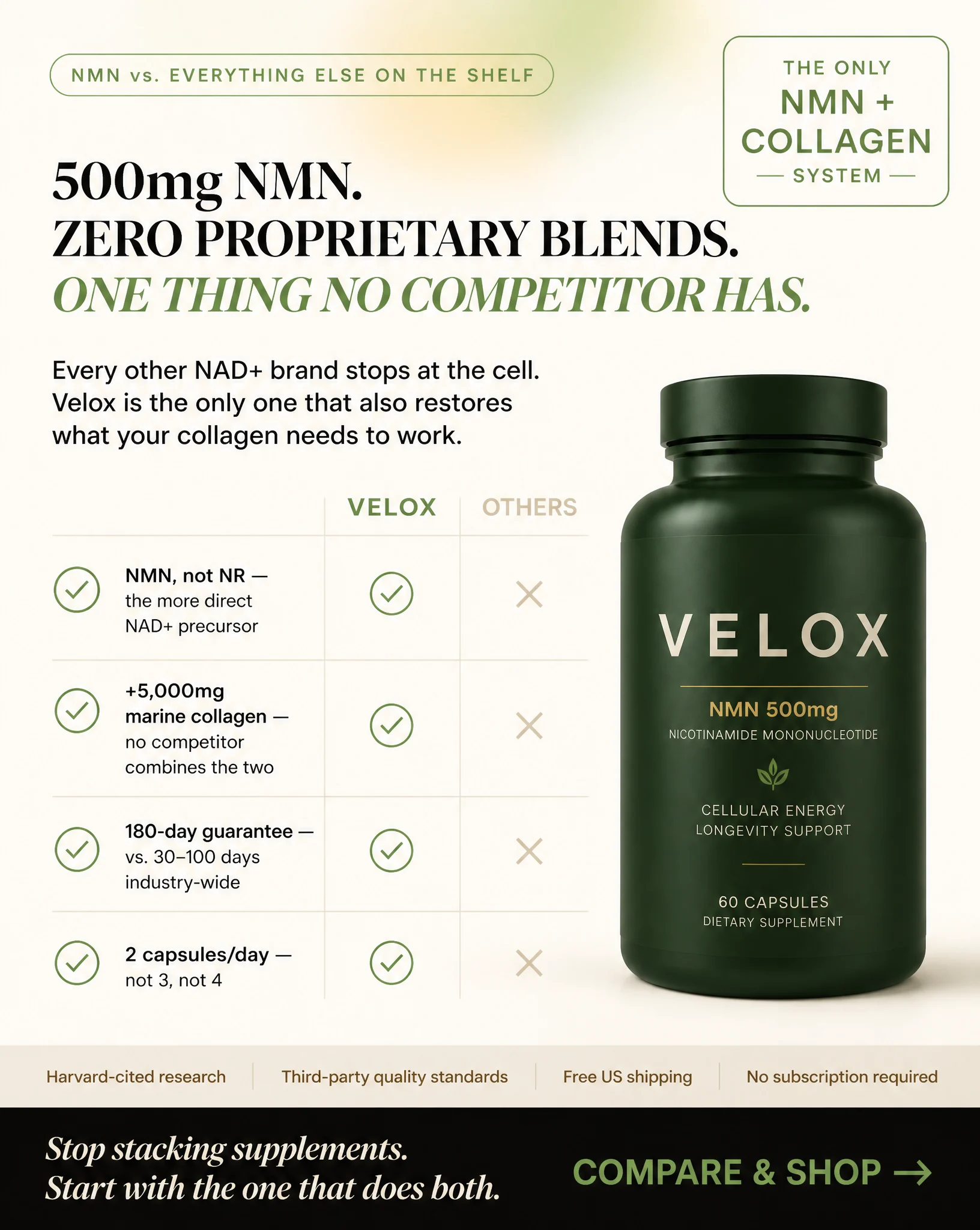
Prompt: Create a 4:5 vertical static ad graphic (1080x1350px) for a premium supplement brand called VELOX, apothecary/wellness aesthetic, comparison/authority tone.BACKGROUND: Warm cream #faf6ee base, soft radial green-gold glow blended at low opacity in the upper background.TOP: Pill eyebrow badge, thin border #ddd0b8, uppercase tracked Inter text #4a7a30: "NMN vs. EVERYTHING ELSE ON THE SHELF"HEADLINE: 3-line Playfair Display serif bold headline, color #0d0804, left-aligned:"500mg NMN.ZERO PROPRIETARY BLENDS.ONE THING NO COMPETITOR HAS."(Italicize "ONE THING NO COMPETITOR HAS" in #5e9c40 as the closing emphasis line)SUBHEADLINE: Inter regular, #2e2214:"Every other NAD+ brand stops at the cell. Velox is the only one that also restores what your collagen needs to work."BODY: 4 checklist-style rows (not icons this time — use simple green checkmarks in circles, color #4a7a30, outline style) in Inter font, bold lead-ins:✅ NMN, not NR — the more direct NAD+ precursor✅ +5,000mg marine collagen — no competitor combines the two✅ 180-day guarantee — vs. 30–100 days industry-wide✅ 2 capsules/day — not 3, not 4(Optional: render this as a subtle 2-column comparison table feel — "VELOX" column with checkmarks vs. a greyed-out "OTHERS" column with muted x-marks in #c4b494 — to visually reinforce the us-vs-them concept, but keep it clean, not busy)PRODUCT: Dark forest-green matte bottle, same gradient and cream wordmark treatment as other ads for brand consistency, positioned bottom-right, soft shadow.TOP-RIGHT CORNER BADGE: Badge with thin green border, cream fill, text "THE ONLY NMN + COLLAGEN SYSTEM" in small uppercase Inter — this badge is slightly larger/more prominent than in other ads since it IS the core claim of this concept.BOTTOM TRUST STRIP: Cream strip #ede6d2, 4 pill badges, muted text #6a5440: "Harvard-cited research · Third-party quality standards · Free US shipping · No subscription required"BOTTOM CTA BAR: Full-width near-black bar #0d0804, italic cream text "Stop stacking supplements. Start with the one that does both." followed by bold light-green "COMPARE & SHOP →" in #5e9c40.STYLE: Confident, authoritative, comparison-driven but still warm — not a harsh vs-battle graphic, keep the premium apothecary calm. Cream and forest green palette only, clean checklist typography, editorial serif headline, no clutter, no stock photography, no aggressive red/x-mark colors — keep even the "against" elements muted and tasteful.