Nano Banana
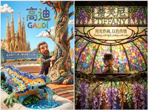
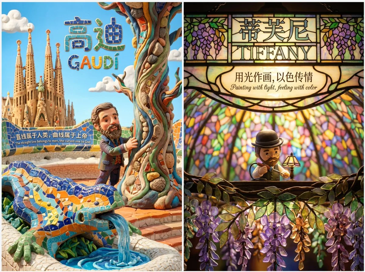
Top-tier Clay Stop-motion Animation Style Poster - Maximum Expression & Immersion
Top-tier clay stop-motion animation style poster for [enter the core theme/character here] - MAXIMUM EXPRESSION & IMMERSION

[1. VISUAL STYLE & ATMOSPHERE]
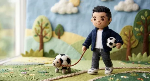
- Style: 3D Clay Art, Q-version cute proportions, Stop-motion Animation aesthetic.
- Texture: Soft matte clay, visible fingerprints, rounded edges, slight imperfections (handmade feel).
- Camera: Macro photography, shallow depth of field (Bokeh), diorama effect.
- Color Palette: [enter colour keywords here, e.g.: Soft Pastel, Dark Gothic, Vibrant Neon].

[2. IMMERSIVE COMPOSITION]
- Concept: A seamless 3D micro-world. The character is embedded in the environment, not just standing in front of it.
- Perspective: [enter the viewpoint here, e.g.: Low angle, Top-down, Fish-eye, Isometric].
- Foreground: [enter foreground objects here, used to add depth].
- Mid-ground: Q-version [enter character description here] doing [enter action here], surrounded by [enter environment elements here].
- Background: [enter background elements here], blurred for depth.

[3. LIGHTING & MOOD]
- Lighting Type: [enter lighting effect here, e.g.: Warm golden hour, Cold moonlight, Dramatic spotlight, Volumetric lighting].
- Shadow: Soft, colored shadows (not pitch black).

[4. INTEGRATED TEXT DESIGN]
- Main Title: "[enter the Chinese title here]" and "[enter the English title here]".
- Title Style: The text is PHYSICALLY formed by [enter the title material here, e.g.: Clouds, Wood, Neon tubes, Stone].
- Body Copy: "[enter the Chinese copy here]" / "[enter the English copy here]".
- Copy Placement: Written directly on [enter the carrier of the copy here, e.g.: A floating paper, A wall, A road sign] within the scene.
- Font Style: [enter the font style here, e.g.: Handwritten, Graffiti, Elegant calligraphy], natural and textured.

[5. TECH SPECS]
- Resolution: 4K Definition, High Fidelity, Octane Render style.

💡 How to fill it in like a designer? (usage guide)
For the best results, follow these "principles" when filling in the [ ] content:
1. Perspective - break the routine
Don't just use "eye level". Try:
Low angle: expresses greatness, a sense of pressure (e.g. Beethoven, Nolan).
Top-down: expresses control, a sense of refinement (e.g. Wes Anderson, Mozart).

Inside-out: such as looking out from a car boot, or out from a cave.
2. Title Material - let your imagination run wild
Don't let the AI generate a font at random; specify an **"object"** related to the theme:
Writing about a musician? The title is made of **"musical staves" or "instrument parts"**.
Writing about a racing driver? The title is made of **"track asphalt" or "tyre marks"**.
Writing about a chef? The title is made of **"flour" or "vegetable slices"**.
3. Copy Placement - no subtitles

Don't let the text float in mid-air; give it a **"place to land"**:
Written on a falling leaf.
Written on a mottled wall.
Written on a crumpled paper ball thrown on the ground.
Written inside a monitor screen.