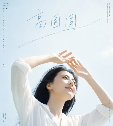
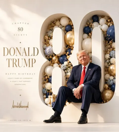
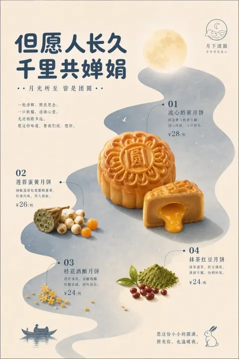
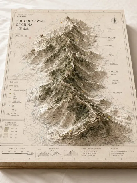
Designed a very simple poster with a high-level commercial aesthetic, the core visual language is “real images through geometrical emotional windows”. A narrow, long, low saturated piece is set in the picture as a visual anchor and space container, and the colour of the piece selects soft and light colours such as fog blue, light green, white, light powder, warm ash or light gold according to the theme. Put [core images] into the colour block in a real photographic sense or in a fine-written way, but not in the colour area entirely, allowing the subject to cross the local border, break the frame and extend to the white area, creating a sense of natural growth and spatial penetration. The background is kept very simple, using large areas of white or grey white, with almost transparent cultural textures, linear graphics, topographic lines, water wave lines, photo contours or abstract symbols, as visual details if present. The whole layout is like a high-end property, luxury goods, aesthetic magazines or air-saving posters, long text, restraint, word-space stretches, headlines, supporting information organized in small fonts. Images require a sense of whiteness in the East, modern order, natural vitality, and a sense of luxury. Avoid disorder, saturation, shadows and cheap templates. Theme: Next to Tianjin, the main visual element: Top-level solar photography style, ins filtering sense, film-grade light, bright light, other requirements: images at least four different levels, different logics and different knowledge points for presentation Background: [White] Ratio [16:9]

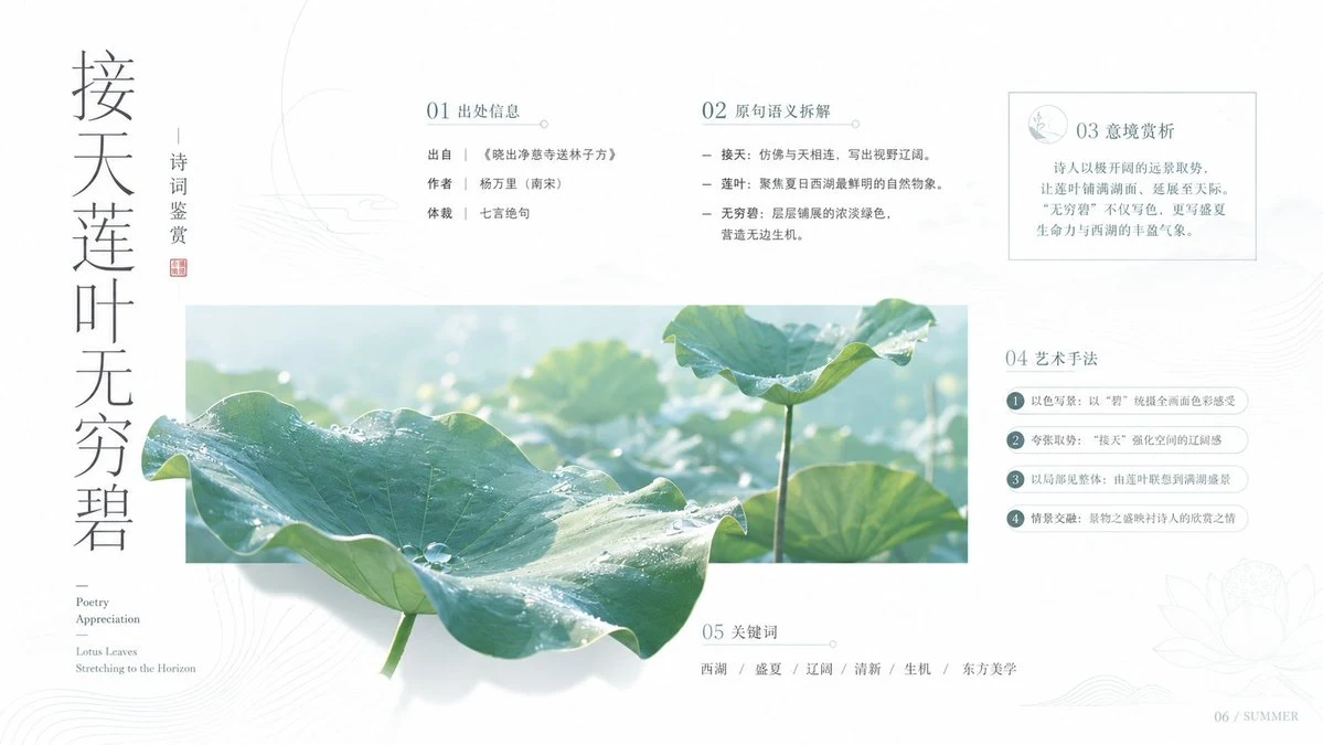
 GPT Image
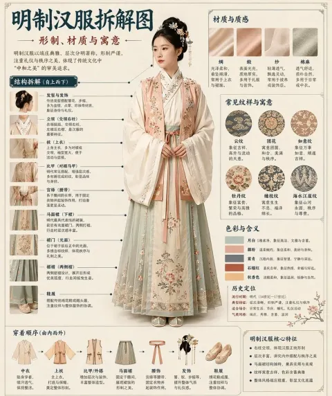
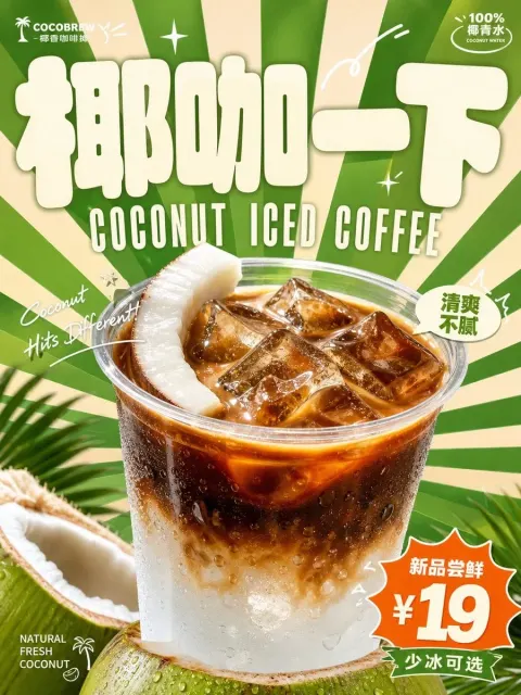

 Midjourney