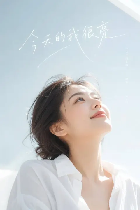
It's about creating a film poster with a big, pure-coloured center on the edge of the picture.
0 copies · 0 views
· by xiaoxiaodong01 · Aug 2, 2026
gpt-image-prompt-it-s-about-creating-a-fil.txt
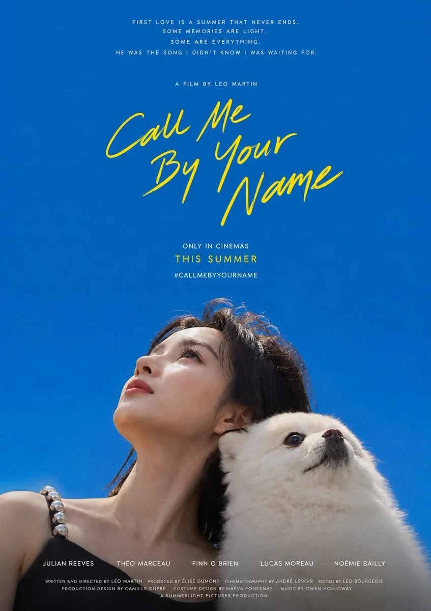
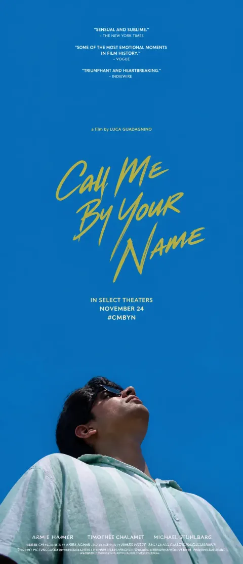
A film poster piece was created around photos provided by users, with the core being the subject of a huge, pure colour field that held itself on the edge of the picture and looked at the sky. About three quarters of the whole picture is a single-coloured, clean, saturated, non-comfort-free field, like the sky that has been stretched beyond limits, creating an open, missed, summer-like breathing feeling; the subject only occupies about a quarter of the narrow band on one side of the picture, leaving the vast majority of space to the open-air colour field. The diagram adapts to the drawings: the frame is marked with a small row at the bottom of the picture and the sky is extended upwards; the frame is marked with a row on one side of the picture (e.g., left); the blank field is spread out to the other (e.g., right) and the text is left in the empty area; and the subject and the text are always separated from each other, regardless of the length. The lens must be a very low angle from below: Each actor's head is leaning back, raising his chin, stretching his throat, looking up at the empty colour field above his head, and the viewer is primarily looking at the bottom of his jaw and the contours of his side or three-quarters of his face — the role is by no means the opposite of the lens, never the same as the lens, not the positive image of the person, not the sight of the viewer, but the sky above his head. Only the head, shoulder and a small upper body are shown and the lower edge is naturally circumscribed by the edge of the image. The subject is not subject to any kind of qualification, and everything is based on the entry of the actual object in the photograph; its identity, number, type and combination must be strictly faithful to the original photograph, which corresponds to the object, and it must not reproduce, reproduce, reproduce or add to the picture objects that are redundant. The key posturing is mutual dependence, rather than one look at each other: each object leans against the back, head against the head, or one side against the other, leans in the opposite or different direction, each object turns its head towards its own side of the sky, and looks in different directions towards the emptiness, rather than at the same point of focus; each object stands up, looks up, looks up, and conveys the whole attachment, closeness and deity. Do not copy the same face or object into more than one person unless the user specifically requests a repetition or mirror. In the empty field, far from the main subject, the words are written by hand, with pens touching white and slightly pened, and the font is random, slightly tilted and tasted by hand, and is tumbled in two or three lines by mistake, using a bright emphasis of colour (light yellow, finely colored by subject matter moods), which makes it look like a private signature floating in the air. Title text content is defaulted to be handwritten in English "Call Me By Your Name" and replaces the user-defined content only when the user provides custom text. The title position is adapted to the painting: the vertical banner falls on the central edge of the upper space field, while the banner falls on the centre of the large white side of the body. Above the title is a smaller line of descriptive text (the default "a film by" style) with two to three smaller lines of colour emphasis or white capital information at the bottom of the heading (the default "IN SELECT THEATERS / NOVEMBER 24 / #CMBYN" displays and label shorts, which can be defined by the user); the vertical version is also available at the top of the stacks of very small white quotes, with a line of white lead scripts and a fine, small, low-key copyright message at the bottom. The main colour field defaults to use the original pure, saturated, slightly deeper cobalt blue/single blue — the clear summer sky-like blue, approximating #0A66AC (very low, green, high blue), clear blue rather than blue, no gray, no purple, no pink blue, no chrysanthemum or ink; the same pure, saturated and high resolution relationship remains to be maintained only when the user has specified the other theme colour. The overall colour role is dominated by a single large area of pure, high-resolution colour field, a warm hand-written emphasis on colour (default light yellow), white text to carry information, and the person to keep the real colour of nature and clothing. The picture is bright, permeable, clean, saturated and undirty, with a warm air of openness and thoughts; even with a darker colour field, the light is clear, the colour is clear, the air is white, and it is not gray, old, dull, dirty or old. The weight of visual power is concentrated in a comparison between the vast empty space and the remote viewing subjects, who must never magnify the picture, never be positive, never lose large areas of vision that remain and fall apart.

 GPT Image
 Nano Banana