GPT Image
Japanese Brush Shop Wordmark Design
Brand Name / Project Name: [Brand Name / Project Name]
Type / Industry: [Type / Industry]
Brand Positioning: [Brand Positioning]
Core Keywords: [Core Keywords]
Emotional temperament: [Emotional temperament]
Layout Direction: [Layout Direction]
Main Tone: [Main Tone]
Secondary Color: [Auxiliary Color]
Aspect ratio: [aspect ratio]
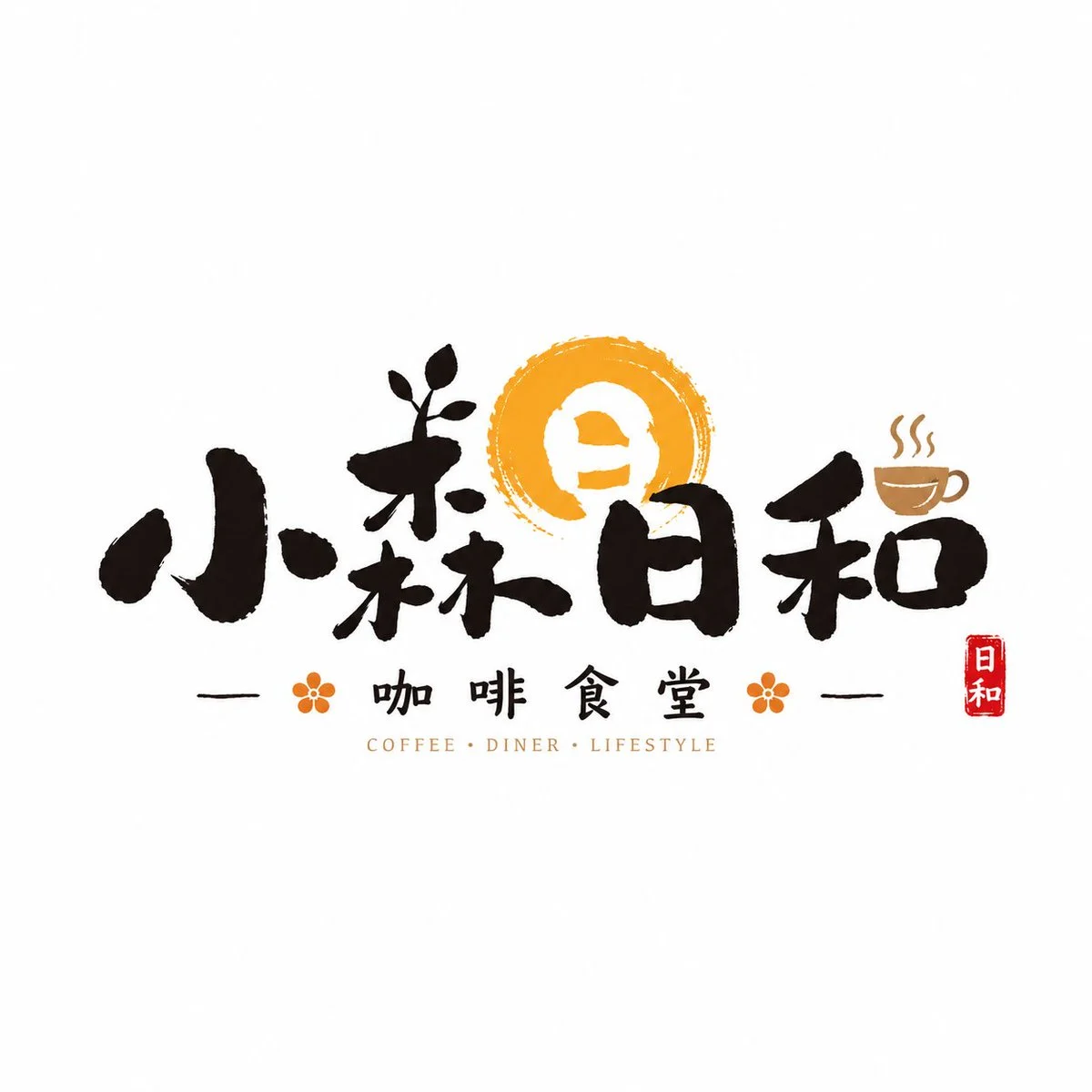
Design a highly polished 'Japanese-style Brush Shop Wordmark.'

Note: This time, the logo is truly commercially viable, not just ordinary font layout, poster titles, or pure calligraphic works. Please focus on the brush writing feel, allowing the main text to have obvious variations in thickness, abrupt movement, slight whitening, and natural stroke movement, while maintaining clarity and strong recognition.

[Main Text Requirements]
1. The brand name is the core body, with handwritten brush strokes in the font style;
2. Strokes should have obvious variations in thickness, pressing and pause, slight whiteness, ink texture, and breathing sensation;
3. Some key strokes can be moderately exaggerated to create memorable points;
4. The font style does not need to be rigid or standardized; it can incorporate natural variations and store signage personalities;
5. The key is to "write character marks in shops," not to turn them into traditional calligraphy exhibition works.

The overall design should have a distinct Japanese-style shop vibe, storefront sign, or noren curtain shop atmosphere. You can appropriately add small red stamps, small vertical explanatory text, a small amount of kana/pinyin/English, and white text blocks on a red background as accents, but these elements must be restrained. Keep the background simple, and the main logo clear and prominent. The final result should look like a high-recognition font that can be directly used by a real Japanese restaurant, izakaya, tea and confectionery shop, cafeteria, or Japanese-style lifestyle brand.