GPT Image
Retro Wordmark Logo Design Guide
Title: Please provide information based on the user's input of [Brand Name / Project Name], [Subtitle / Product Name], [Type/Industry], [Brand Positioning], [Core Keywords], [Emotional Temperament...

Prompt: Based on the user's input of [Brand Name / Project Name], [Subtitle / Product Name], [Type/Industry], [Brand Positioning], [Core Keywords], [Emotional Temperament], [Main Color Tone], [Auxiliary Colors], [Aspect Ratio], design a highly completed 'Retro Title Wordmark Logo.'

[User Input]
Brand Name / Project Name: [Brand Name / Project Name]
Subtitle / Product Name: [Subtitle / Product Name]
Type / Industry: [Type / Industry]
Brand Positioning: [Brand Positioning]
Core Keywords: [Core Keywords]
Emotional temperament: [Emotional temperament]
Main Tone: [Main Tone]
Secondary Color: [Auxiliary Color]
Aspect ratio: 1:1

[Core Objectives]
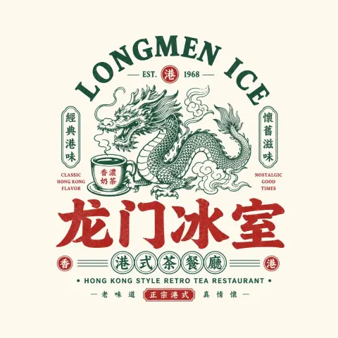
This time, the design is a genuine logo—a retro title logo centered on text. The overall design must prioritize the attributes of "logo design": independent, clear, recognizable, standalone and viable with a strong brand identity.

At the same time, this logo should not be just a plain font with changes to ordinary fonts; it should maintain the logo's attributes while adding appropriate decorative lines, auxiliary shapes, partial fills, and patterned treatments, giving it a "retro title" style, refinement, and visual memorable points.

[Most Important Principle]
1. The retro feel must mainly come from font design, stroke style, structural proportions, decorative logic, and local patterned treatments, not from old paper materials, distressed effects, poster backgrounds, or sticker borders.
2. It can enhance decorativeness but must not lose the logo's independence and recognition.
3. All auxiliary elements must serve the logo itself; results cannot be turned into stickers, labels, tickets, or poster pages.

[Font Design Requirements]
1. Use [Brand Name / Project Name] as the absolute core visual core, designing it as an independent font logo.
2. Text must be clearly customized; ordinary computer fonts cannot be used directly.
3. Please express the "retro title feel" in the following ways:
 - More headline glyph skeleton
 - A stroke style with a stronger sense of era
 - More decorative yet still clearly recognizable structures
 - Visual language similar to old signboard fonts, vintage film titles, old book cover titles, and old-era brand logos
4. You can appropriately incorporate vintage-style font features, such as:
 - Retro Song Dynasty style, old black font, old signature font, decorative font, and the feel of the film title
 - More pronounced contrast between thickness and thickness
 - More titled proportions and center of gravity
 - More rhythmic stroke relationships
5. Maintain logo readability, recognition, and overall integrity.

[Style Enhancement Layer Requirements]
Please add an appropriate amount of "style enhancement layer" to the logo body, but it must be restrained and serve the font itself. The following elements can be used:
1. Decorative Lines:
 - Detailed dividers
 - Lateral extension line
 - Symmetrical auxiliary lines
 - Localized radiation
 - Balance lines on both sides of the title
2. Small auxiliary shape:
 - Small dots
 - Small triangle
 - Rhombus
 - Minimalist emblem symbol
 - Small decorative seal patterns
 - Symmetrical small icons
3. Local fills and patterns:
 - Fill with stripes inside the strokes
 - Partial black-and-white inversion of the block
 - Dotted or fine linear filling
 - Decorative cross-section
 - Partial pattern patterns
 - Slightly engraved internal patterns
4. Local Graphic Enhancement:
 - Certain strokes can evolve into vintage decorative structures
 - Some characters can incorporate minimalist patterns internally, but they must not overshadow the main character
 - Make the text look more like a "designed title logo" rather than just typing

[Requirements]
1. The main body must be the logo itself.
2. A small amount of auxiliary content can be added, such as:
 - English name
 - Pinyin
 - Subtitle
 - Industry description
 - slogan
3. A small amount of auxiliary lines or decorative symbols can be added to enhance completeness and style, but must be restrained.
4. All these elements should be organized around the logo itself and should not be expanded into a single complex layout.
5. Do not use large ticket frames, label outlines, sticker edges, packaging baseboards, or exaggerated decorative shapes.

[Image Presentation Requirements]
1. The screen should look like a "logo display image / logo proposal page," not a poster.
2. Display your logo with a simple, clean, and low-profile background.
3. Backgrounds can be neutral backgrounds such as white, light gray, or off-white.
4. The focus of the image is on showcasing the logo itself and its details, rather than the ambient atmosphere.
5. The layout may include a few supplementary notes, but the overall focus must be on logo display.

[Color Requirements]
1. Focus on the color of the logo, not the background material.
2. You can use [Main Color] and [Secondary Color] according to brand attributes.
3. Colors can have a slight retro tendency, but keep them clean, iconic, and branded.
4. You can use small amounts of vintage colors such as deep red, dark green, old gold, dark brown, and black-gray, but do not rely solely on material rendering.
5. Avoid large areas of old paper, wear, aged noise, dirty textures, and exaggerated particles to create style.

[Style Keywords]
Logo priority, wordmark design, wordmark, retro title feel, brand logo, title word, old signboard font, film title feel, decorative lines, partial patterning, structured filling, refined, independent, highly recognizable, can be used independently, and is considered premium.

[Acceptance Criteria]
If you remove the background and auxiliary notes, the font itself can still stand independently as a logo; At the same time, it has a distinct retro title style, rather than a typical typing effect.

[Output Requirements]
Please finally output a highly completed retro title logo. It must first be a mature logo design, then have a clear vintage title style, and include appropriate decorative lines, auxiliary graphics, and partial pattern filling, making it more stylistically recognizable, rather than just a simple set of fonts.