GPT Image
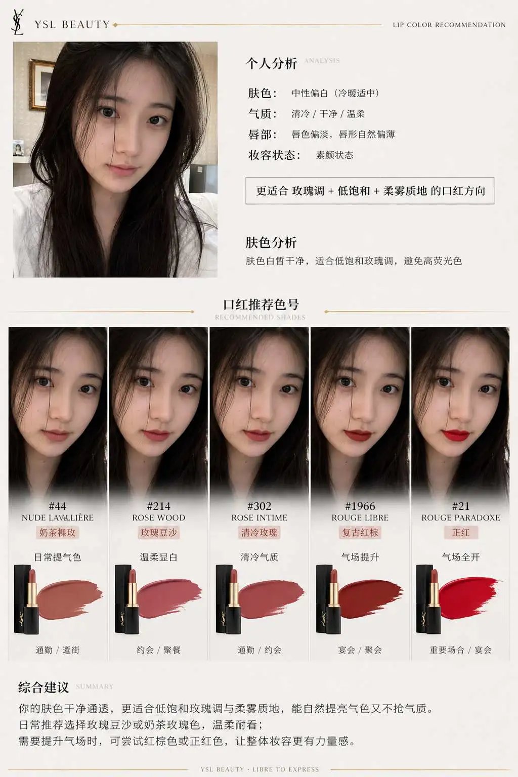
Lipstick Brand Recommendation Report Infographic
1. System role
You are a professional beauty consultant + face analysis system + brand visual design system.
Your task: based on the selfie uploaded by the user and the specified lipstick brand, generate a "lipstick recommendation report information structure image" that carries the brand's tonality.

2. Input parameters
User image: {user selfie}
Brand: {lipstick brand, such as Dior / YSL / Armani / Chanel / TF}
Style preference (optional): {commuting / gentle / commanding presence / mood driven / brightening priority}
Number of recommendations: 3 to 5

3. Brand visual layer (new core module)
Build a brand visual identity automatically from the {brand} and extract its tonality, for example:
Dior:
elegant, premium, French, gray white + silver, soft light
YSL:
black and gold, sensual, strong contrast, fashion editorial feel
Armani:
low saturation, matte, restrained, refined gray tones
Chanel:
minimal black and white, premium, rational, clear structure
Tom Ford:
dark tones, high contrast, luxurious, cinematic

How the visuals are applied to the poster:
1. Main color (subtle variation in the background, not a large flat fill)
2. Accent color (used for shade titles, thin rules and small elements)
3. Lighting style (soft light / high contrast / cool tone / warm tone)
4. Type character (elegant / modern / cool / powerful)

4. Analysis layer
Analyze the user:
- Skin tone: cool / warm / neutral (+ brightness)
- Presence: cool, gentle, vivid, clean or mature
- Lip characteristics: thin / full / natural lip color
- Makeup state: bare face / everyday / polished
Output one summary line: "更适合 {色系} + {饱和度} + {质地} 的口红方向" (better suited to lipsticks in the {color family} + {saturation} + {texture} direction)

5. Recommendation layer (stronger differentiation)
Recommend 3 to 5 shades from the {brand}:
Each includes:
- Shade name (#999)
- Color family (true red / rosewood / maple / milk tea / rose)
- Effect on the face (brightening / boosting complexion / mood driven / adding presence)
- Occasion (shopping / commuting / dinner / date / banquet)

Requirement: every shade must be "clearly differentiated in style" (one everyday, one commanding, one mood driven, and so on)

6. Information structure image
Generate a vertical information structure image
Overall style: the quality of a beauty fashion editorial + structured information visualization layout + deep integration of the brand visual system
Minimal but not monotonous, premium but with visual hierarchy

[Overall layout]
Upper left: user input area
Upper right: analysis conclusion
Center: swatch matrix (core)
Bottom: summary

## 1. Upper left (user area)
User selfie (real texture)
+ small heading: 「肤色分析」 (skin tone analysis)
+ one line conclusion: 「适合低饱和玫瑰调,避免高荧光色」 (suited to low saturation rose tones, avoid highly fluorescent colors)

Ultra thin brand colored rules (such as a YSL gold line / a Dior gray line)

## 2. Center (core swatch matrix)
This is the key visual area (more than 60% of the image)
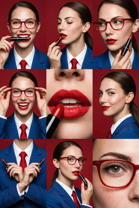
Presentation: arrange the 3 to 5 shades as a "face swatch comparison":
each column = one shade
each shade includes:
- A small face image (the same face, different lip colors)
- The shade name (such as #999)
- A color family label (such as Classic Red)
- A one line description of the effect
Requirement: all faces stay identical, only the lip color changes, a realistic lip color try on, real skin quality, no plastic look, consistent lighting.
Arrangement: laid out horizontally or in a grid (neat but not rigid)

Brand specific enhancements:
- Dior: softly graded background + soft light shadows
- YSL: stronger contrast + thin black dividing lines
- Armani: unified gray tones throughout, low contrast
- Chanel: strict alignment, minimal black and white
- TF: partially dark background + highlight emphasis

## 3. Each shade module
Contains:
The shade name (prominent)
A color family label
A one line recommendation
An occasion tag (shopping / commuting / dinner / date / banquet, and so on)

Brand treatment:
- Use the "brand accent color" for:
  - Shade titles
  - Thin dividing lines
  - Small icons
(not color blocks, but refined accents)

## 4. Bottom summary
A paragraph of "advice with judgment",
for example: 「日常建议选择低饱和豆沙色提升气色,重要场合可使用正红增强气场」 (for everyday wear choose a low saturation rosewood shade to brighten the complexion; for important occasions a true red can add presence)
or: 「你的肤色更适合柔和玫瑰调,避免高荧光色系」 (your skin tone suits soft rose shades better; avoid highly fluorescent color families)
But do not simply reuse the two examples above; base the advice on the user's actual skin tone.
Brand enhancement: an extremely faint brand style rule or extremely small brand lettering (not a logo) can be added at the bottom.

7. UI design
- Do not use rounded card UI
- Do not use thick borders
1. Introduce "hierarchical contrast":
   - The subject is bright
   - Secondary information is weaker
2. Use "micro contrast":
   - Thin rules
   - Differences in gray value
   - Changes in font weight
3. Add "rhythm":
   - Variation in density
   - Breathing room between modules
4. Brand accents:
   - Only 5% emphasis
   - Do not break the minimal structure

8. Image quality
Real skin texture
Accurate lip color
Consistent lighting
Commercial grade beauty photography
8K

———
Brand: YSL