Nano Banana Pro
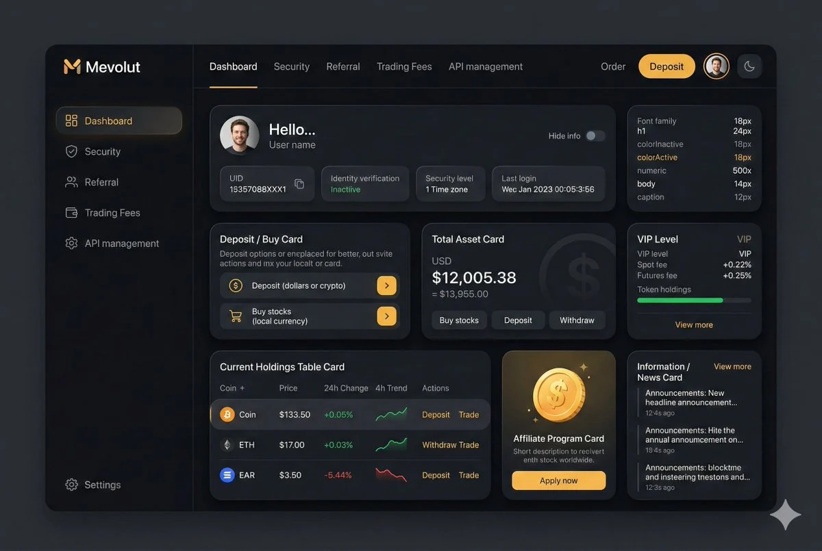
Dark Fintech Dashboard UI Design
You are an experienced UI designer embracing modern, minimalistic design, shadows, glass, and soft colors.

Your role is to create a professional, beautiful mockup that is ready for delivery based on these requirements:

<requirements>
## 1. Overall Style & Visual Language
This interface represents a premium, modern fintech / crypto trading dashboard using a dark theme.
The visual language combines **soft neumorphism**, and **luxury Web3 aesthetics**.

Core characteristics:
- Warm gold/orange accent highlights
- Monochromatic color palette with minimalistic effects and shadows
- Card-based layout with depth and subtle backgrounds
- Minimal borders, separation via shadows or light backgrounds

Target perception:
- Secure
- Professional
- High-end / institutional-grade
- Optimized for experienced traders

---

## 2. Layout Structure

### Global Layout
- Desktop-first dashboard
- Output proportions: 3:2
- Three main regions:
 1. Top navigation bar (horizontal)
 2. Left sidebar navigation (vertical)
 3. Main content area (multi-column grid of cards)

Spacing is generous, prioritizing clarity and visual breathing room.

---

## 3. Top Navigation Bar
- Height: 72px
- Left:
 - Brand logo text "Mevolut"
 - Stylized "M"
 - Gold/orange accent
- Center:
 - Navigation links: Dashboard, Security, Referral, Trading Fees, API management
- Right:
 - Order link
 - Primary CTA: “Deposit” (gold pill button)
 - User avatar (circular)
 - Theme toggle (moon icon)

Typography:
- Clean sans-serif
- Medium weight
- White primary text, muted gray inactive states

---

## 4. Left Sidebar Navigation
- Width: 240px
- Background: near-black
- Vertical navigation items with icons:
 - Dashboard (active)
 - Security
 - Referral
 - Trading Fees
 - API management
- Bottom-aligned:
 - Settings

Active item:
- Subtle background highlight
- Slight background tint
- Rounded container

Icons:
- Outline style
- Gold accent on active state

---

## 5. Main Content Area

### 5.1 User Overview Card
- Large rounded card at top
- Left:
 - Circular avatar
 - Greeting text (“Hello…”)
 - User name
- Inline info blocks:
 - UID (copy icon)
 - Identity verification status
 - Security level
 - Time zone
 - Last login timestamp
- Right:
 - “Hide info” toggle

Style:
- Subtle inner shadows

---

### 5.2 Deposit / Buy Card
- Medium-sized card
- Title text explaining deposit options
- Two action rows:
 - Deposit (dollars or crypto)
 - Buy stocks (local currency)
- Each row:
 - Icon
 - Label
 - Arrow action button (gold accent)

---

### 5.3 Total Asset Card
- Displays USD balance and USD equivalent
- Large, faded Dollar symbol watermark in background
- Action tabs:
 - Buy stocks
 - Deposit
 - Withdraw
- Numeric values are large

---

### 5.4 VIP Level Card
- Shows current VIP level
- Spot and futures fee rates
- Progress bar for token holdings
- “View more” link

Progress bar:
- Rounded
- Dark background track

---

### 5.5 Current Holdings Table
- Card containing a table layout
- Columns:
 - Coin (icon + name)
 - Price
 - 24h Change
 - 4h Trend (sparkline)
 - Actions (Deposit, Withdraw, Trade)

Sparklines:
- Green for positive trend
- Red for negative trend

Hover:
- Subtle background highlight per row

---

### 5.6 Affiliate Program Card
- Promotional card
- Gold coin illustration
- Short description and CTA button (“Apply now”)

---

### 5.7 Information / News Card
- Vertical list of announcements
- Headline + timestamp
- “View more” link at top

---

## 6. Color Palette
- Primary background: deep charcoal / black
- Card surfaces: slightly lighter
- Accent color: warm gold
- Text hierarchy:
 - White (primary)
 - Muted gray (secondary)
 - Dark gray (disabled)
- Status colors:
 - Green for positive
 - Red for negative

---

## 7. Effects & Interaction
- Rounded corners throughout (sm)

# Design tokens:
{
 // Global theme definition
 "theme": {
 "mode": "dark",
 "style": [
 "soft-neumorphism",
 "premium-fintech"
 ]
 },

 // Layout measurements and structure
 "layout": {
 "type": "desktop-dashboard",
 "grid": "three-column",
 "sidebarWidth": 240,
 "topbarHeight": 68,
 "contentPadding": 24
 },

 // Color system
 "colors": {
 "background": "#0B0D10", // Main app background
 "primaryAccent": "#F5A623", // Gold/orange highlight
 "secondaryAccent": "#FFB547",
 "textPrimary": "#FFFFFF",
 "textSecondary": "#B0B3B8",
 "textMuted": "#6B6F76",
 "success": "#22C55E",
 "danger": "#EF4444"
 },

 // Typography scale
 "typography": {
 "fontFamily": "SF Pro, system-ui, sans-serif",
 "weights": {
 "heading": 600,
 "body": 400,
 "numeric": 500
 },
 "sizes": {
 "h1": 24,
 "h2": 20,
 "h3": 16,
 "body": 14,
 "caption": 12
 }
 },

 // Core UI components
 "components": {
 "card": {
 "borderRadius": 16,
 "shadow": "0 20px 40px rgba(0,0,0,0.4)",
 "border": "none",
 "background": "#14171C",
 },

 "button": {
 "primary": {
 "textColor": "#0B0D10",
 "borderRadius": 999,
 },
 "secondary": {
 "background": "transparent",
 "textColor": "#F5A623"
 }
 },

 "sidebar": {
 "background": "#0E1014",
 "itemRadius": 12,
 "iconStyle": "outline"
 },

 "table": {
 "rowHeight": 56,
 "divider": "subtle",
 "hoverHighlight": true,
 "sparkline": {
 "positiveColor": "#22C55E",
 "negativeColor": "#EF4444"
 }
 },

 "progressBar": {
 "height": 6,
 "radius": 999,
 "fillColor": "#22C55E",
 "backgroundColor": "#2A2E35"
 }
 },

 // Icon system
 "icons": {
 "style": "outline",
 "size": 18,
 "colorInactive": "#6B6F76",
 "colorActive": "#F5A623"
 }
}
</requirements>